7 Best Holistics BI Competitors & Alternatives (2026 Tested)
 Natan Cohen··22 min read
⚡Key Takeaways
- Qrvey: Best for SaaS teams needing embedded, multi-tenant analytics at scale
- Tableau / Power BI: Best for enterprise BI and dashboarding
- Looker / ThoughtSpot: Best for governed data models and search-driven analytics
- Mode / Metabase: Best for technical teams and lightweight, flexible BI
If you’re using Holistics and starting to hit limitations around embedded analytics, e.g., multi-tenant self-service, scalability, or long-term flexibility for SaaS, you’re not alone. These challenges tend to surface as analytics becomes a more critical part of the product experience.
If you’re evaluating Holistics or seeking alternatives, this guide walks through the best alternatives and when each one actually makes sense.
Top 7 Holistics BI Alternatives Compared
| Tool | Best For | Standout Feature | Starting Price |
|---|---|---|---|
| Qrvey | Embedded SaaS analytics | Multi-tenant architecture | Custom, flat-rate |
| Tableau | Enterprise visualization | Advanced dashboards | $15/user/month |
| Power BI | Microsoft ecosystem users | Low-cost enterprise BI | Free |
| Looker | Data modeling (dbt-like) | Semantic model (LookML) | Custom |
| ThoughtSpot | Search-driven analytics | Natural language queries | $25/user/month |
| Mode | Data science + SQL workflows | Notebook-style analysis | Free |
| Metabase | Open-source BI | Simple self-service analytics | Free |
If your goal is embedded analytics or multi-tenant SaaS delivery, Qrvey stands out early.
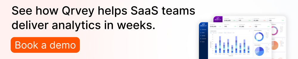
#1. Qrvey – Best for Embedded Analytics & Multi-Tenant SaaS
If you are building a modern analytics experience in your SaaS product, Qrvey’s embedded analytics is a top choice for your short list.
Qrvey is purpose-built for SaaS companies embedding analytics into their products. Unlike traditional BI tools, it handles multi-tenant data, white-label dashboards, seamless embedding, and scalable deployments without workarounds.
Key features
Qrvey focuses on embedded analytics, multi-tenancy, and giving product teams full control over the data experience they deliver to customers.
Stand Out Feature #1 Built-in multi-tenant architecture
This is where many SaaS product teams see the biggest gap between Qrvey and tools like Holistics or Tableau.
With most BI tools, you end up stitching together tenant logic yourself, separate schemas, filters, workarounds, or even entire duplicated environments. It works at first, but it doesn’t scale cleanly.
Qrvey allows SaaS companies to manage analytics across thousands of customers within a single environment. Each tenant’s data is isolated but centrally controlled, removing the need to maintain separate BI instances or complex data pipelines.
See how Qrvey approaches RLS in this clickable demo.
This is especially valuable for SaaS platforms scaling quickly, where operational overhead becomes a major bottleneck with tools like Tableau or Looker. Instead of retrofitting multi-tenancy, Qrvey delivers it natively, ensuring performance, security, and easier lifecycle management.
Stand Out Feature #2 True embedded, white-label analytics
A lot of BI tools say they “support embedding.” In reality, they give you an iframe and limited control.
Qrvey goes much deeper. You can fully embed analytics into your product and make it feel completely native: branding, UX, workflows, everything.
The difference shows up when you’re building a customer-facing experience. Customers experience analytics as part of your product, not a third-party tool. Compared to BI tools with basic embedding, Qrvey gives much deeper control over UX and workflows.
This is critical for product teams looking to monetize analytics or differentiate their platform with personalized experiences, rather than just expose static dashboards.
Stand Out Feature #3 End-to-end
One thing we’ve seen slow teams down is having to piece together ingestion, storage, modeling and visualization across multiple tools.

Qrvey includes everything in one platform. This removes the need for stitching together pipelines, warehouses, and BI tools. Teams can ingest data from APIs, databases, or files, then model and visualize it, all within Qrvey. This unified approach reduces engineering complexity and speeds up time-to-value, especially for SaaS companies that don’t want to build and maintain an entire analytics infrastructure from scratch.
Pricing
Qrvey offers flat-rate pricing designed for SaaS scalability rather than per-seat licensing.
| Plan | Pricing |
|---|---|
| Qrvey Pro | Flat-rate |
| Qrvey Ultra | Flat-rate |

Where Qrvey shines
- Built for SaaS products, not internal BI: This is the biggest difference. Everything is designed for customer-facing analytics.
- Multi-tenant by default: No workarounds or custom architecture needs
- Flexible embedding: You have the full control over the experience, including UI, branding, and workflows.
Where Qrvey falls short
- Not ideal for internal BI-only teams: Optimized for providing embedded analytics experience to SaaS customers.
- Not ideal for B2C companies: It’s too powerful to match consumer self-service reporting needs, it’s designed for business users of B2B SaaS products.
Customer reviews
Qrvey has helped CrowdChange who needed to build and scale customer-facing analytics. By using Qrvey, they were able to deliver multi-tenant, self-service analytics, reduce internal effort, and iterate faster based on client needs.
On third-party review sites, users consistently highlight Qrvey’s flexibility for embedded use cases and its ability to simplify complex architectures. Some note a learning curve when implementing advanced features but praise the long-term scalability.


Who Qrvey is best for
- SaaS product teams: Need to embed customer-facing analytics at scale
- Growing companies: Want opportunities to monetize analytics
- Platforms with multi-tenant data: Deliver multi-tenant analytics without rebuilding architecture
Tableau

Tableau is one of the most widely used BI tools for enterprise data visualization, known for its powerful dashboards and rich interactivity. It’s best suited for internal analytics rather than embedded SaaS use cases.
Key features
Advanced dashboards
Tableau enables highly interactive visualizations, allowing users to explore data dynamically through filters, drill-downs, and custom views without coding.
Data connectivity
It connects to a wide range of databases and cloud sources, enabling unified analytics across multiple systems and supporting both live queries and extracts.
Pricing
Tableau uses per-user pricing, starting at $15/user/month, with higher tiers for advanced cases.
| Plan | Pricing |
|---|---|
| Tableau Cloud | Starts at $15/user/month |
| Tableau Server | Starts at $15/user/month |
| Tableau Next | Starts at $40/user/month |
Where Tableau shines
- Visualizations: This is still where Tableau stands out. If your job is to explore data, build polished dashboards, and help internal stakeholders “see” what’s happening, it’s hard to beat.
- Enterprise adoption: There’s a huge community, strong documentation, and plenty of talent available. That makes hiring, onboarding, and scaling a Tableau environment much easier than with newer tools.
Where Tableau falls short
- Not built for embedded SaaS use cases: You can embed Tableau, but it never really feels like a native product experience. It’s more of an add-on than something deeply integrated.
- Cost scaling: As soon as you extend access to customers or larger teams, per-user pricing becomes a real limitation, especially compared to usage-based or product-oriented platforms.

Customer reviews
According to third-party reviews, users love Tableau’s visualization power but often mention pricing and deployment complexity as challenges.


Who Tableau is best for
- Internal analytics teams: If your focus is helping internal stakeholders explore data and build dashboards, Tableau fits naturally.
- Organizations prioritizing visualization: We’ve seen teams choose Tableau when presentation quality matters more than embedding or product integration into a customer-facing experience.
Power BI

Microsoft Power BI is a cost-effective BI platform tightly integrated with the Microsoft ecosystem, making it a strong choice for companies already using Azure, Excel, or Office tools.
Key features
Microsoft integration
Power BI integrates seamlessly with Excel, Azure, and Microsoft 365, enabling easy data sharing and collaboration across teams.
Low-cost scaling
It offers competitive pricing, making enterprise BI accessible even for smaller teams compared to premium BI platforms.
Pricing
Power BI offers a free tier, with paid plans starting at around $10/user/month, and premium capacity options for larger deployments.
| Plan | Pricing |
|---|---|
| Free account | Free |
| Power BI Pro | Starts at $15/user/month |
| Power BI Premium Per User | Starts at $40/user/month |
| Power BI Embedded | Variable |
Where Power BI shines
- Affordable enterprise BI: This is usually why teams start with Power BI. We’ve seen some organizations use Power BI as a low-cost entry point without breaking the budget.
- Seamless Microsoft integration: If you’re already in Excel, Azure, or Teams, everything just connects easily. That familiarity reduces friction and speeds up adoption across non-technical users.
Where Power BI falls short
- Limited embedded flexibility: You can embed Power BI, but it doesn’t give you the level of control product teams usually want. It still feels like you’re exposing a tool, not building a native experience.
- Performance and scaling constraints: As datasets and usage grow, I’ve seen teams hit limits around performance, governance complexity, and managing large deployments.

Customer reviews
Users on third-party review sites highlight affordability and ease of use but note limitations in customization and scalability.


Who Power BI is best for
- Microsoft-first organizations: If your stack already lives in Azure or Office, Power BI fits naturally.
- Cost-conscious teams: I’ve seen smaller teams adopt it quickly because the pricing is hard to beat, especially for internal reporting rather than customer-facing use cases.
Looker

Looker focuses on governed analytics through its semantic modeling layer, LookML, making it ideal for organizations that prioritize consistent data definitions.
Key features
LookML modeling
This is the biggest reason teams choose Looker. You define metrics once and reuse them across dashboards, which keeps everything consistent and reduces reporting chaos.
Strong Google Cloud + AI ecosystem
Since becoming part of Google Cloud, Looker benefits from integrations with BigQuery and AI-driven capabilities (like conversational analytics and automated insights), making it easier to explore data and move faster from question to answer.
Pricing
Looker pricing model includes a platform fee combines with user-based licensing.
| Plan | Pricing |
|---|---|
| Standard | User-based pricing |
| Enterprise | User-based pricing |
| Embed | User-based pricing |
Where Looker shines
- Single source of truth across teams: What I’ve seen with Looker is that it forces teams to standardize metrics early. That can feel heavy at first, but it prevents the “same metric, different number” problem that shows up in more flexible BI tools.
- Developer-first workflows: Looker fits well with engineering teams because you can version-control your data models and treat analytics more like software.
Where Looker falls short
- Steep learning curve: LookML is powerful, but we’ve seen it slows teams down early on. It requires technical skills and dedicated ownership, which not every team has.
- Performance and UX tradeoffs: Users frequently mention slower performance with large datasets and less advanced visualization compared to tools like Tableau.

Customer reviews
From what we’ve seen across G2 and Capterra, teams value Looker’s centralized dashboards and ability to create consistent metrics across the business.
The tradeoff shows up in complexity. Looker users often point to the learning curve and performance issues with large datasets.


Who Looker is best for
- Data-mature organizations: If you care about governance and consistent metrics across teams, Looker is a strong fit.
- Teams with analytics engineering resources: In our experience, it works best when you have people who can own the LookML layer and maintain it over time.
ThoughtSpot

ThoughtSpot offers search-driven analytics, allowing users to query data using natural language instead of building dashboards manually.
Key features
Natural language search
ThoughtSpot is built around search. Users can type questions and instantly generate visualization and insights without SQL knowledge. This is appealing to less-technical users who don’t want to rely on analysts.
AI-driven insights
ThoughtSpot Ai can surface insights automatically, highlighting trends, anomalies, and drivers behind metrics.
Pricing
ThoughtSpot offers user-based pricing model.
| Plan | Pricing |
|---|---|
| ThoughtSpot Analytics | |
| Essentials | $25/user/month |
| Pro | $50/user/month or $0.10/query |
| Enterprise | Custom quote |
| ThoughtSpot Embedded | |
| Developer | Free |
| Enterprise | Custom quote |
Where ThoughtSpot shines
- Fast time-to-insight: This is where ThoughtSpot really stands out. Natural-language search removes a lot of friction for business users.
- Strong for self-service analytics: We’ve seen teams adopt it quickly because non-technical users can explore data without relying on analysts or learning SQL.

Where ThoughtSpot falls short
- Limited depth for advanced analysis: Once you get past simple exploration, it can feel restrictive. Analysts often need more control than what the search interface provides.
- Less flexibility for embedded use cases: Like most BI tools, it’s not designed for building deeply integrated, customer-facing analytics experiences.
Customer reviews
ThoughtSpot users on third-party review sites appreciate ease of use but note limitations for advanced analytics needs. The main pushback comes from analysts, who feel limited once they need more complex modeling or customization beyond the search experience.


Who ThoughtSpot is best for
- Business users and executives: If the goal is fast answers without SQL or dashboard building, this works well.
- Organizations prioritizing self-service: We’ve seen it fits best when the goal is reducing reliance on data teams rather than enabling deep technical analysis.
Mode

Mode combines SQL, Python, and visualization in a single environment, making it popular among data teams.
Key features
SQL, Python and R in one workflow
This is why most teams adopt Mode. You can write a SQL query, then immediately run Python or R on top of those results. You don’t need to export it or start separate notebooks. In practice, it creates a much smoother workflow for deeper analysis and modeling.
Notebook-style analytics and dashboards
Mode blends notebooks and BI. You can explore data in a notebook, then turn that work into dashboards or shareable reports. We’ve found this especially useful when teams want to move from exploration to presentation without switching tools.
Pricing
Mode includes a free tier, with paid plans for teams requiring advanced collaboration and governance capabilities.
| Plan | Pricing |
|---|---|
| Studio | Free |
| Pro | Custom-quote |
| Enterprise | Custom-quote |
Where Mode shines
- Built for analyst workflows: Mode feels natural if you’re already writing SQL. You can explore, analyze, and publish insights without jumping between tools.
- Strong collaboration: Teams can share notebooks, comment on analyses, and build on each other’s work, which makes it easier to turn analysis into actionable inisghts for the business.
Where Mode falls short
- Not ideal for non-technical users: If you don’t know SQL (or don’t want to), Mode can feel intimidating pretty quickly
- Limited embedded analytics: Mode is not designed specifically for SaaS embedded analytics.
- Basic dashboards: Visualization and dashboard features are solid, but not as polished or flexible as tools like Tableau or Power BI.
Customer reviews
Mode is loved by technical teams for SQL-based analysis, but less approachable for business users.


Who Mode is best for
- Data analysts and data science teams: If you’re working in SQL and Python daily, Mode fits naturally.
- Companies with a modern data stack: It works best when teams already have a warehouse (Snowflake, BigQuery) and want a central place to analyze and share insights.
Metabase

Metabase is an open-source BI tool focused on simplicity and accessibility, ideal for smaller teams.
Key features
No-code, self-service analytics
Metabase is one of the easiest BI tools to get started with. You don’t need SQL to build dashboards—most people can create charts using a simple UI. We’ve seen teams spin up reporting almost immediately without needing a dedicated data team.
Open-source flexibility
You can host Metabase yourself, customize it, and control your data environment. For teams that care about cost or infrastructure ownership, this flexibility is something most BI tools don’t offer.
Pricing
Metabase offers a free open-source version. And there are paid cloud plans available.
| Plan | Pricing |
|---|---|
| Open Source | Free |
| Starter | $100/month + $6/user/month |
| Pro | $575/month + $12/user/month |
| Enterprise | Starts at $20K/year, custom pricing |
Where Metabase shines
- Fast setup and ease of use: Metabase is not overly complex, which makes it accessible to a much wider group of users.
- Low cost and open-source option: For startups or smaller teams, the free version removes a huge barrier to getting started with BI.
Where Metabase falls short
- Limited scalability for complex use cases: As data grows or requirements become more advanced, teams often start to outgrow Metabase. It’s not designed for heavily modeled data or complex analytics workflows.
- Basic feature set compared to enterprise tools: Visualization, governance, and embedding capabilities are relatively lightweight compared to platforms like Looker or Tableau.

Customer reviews
From third-party reviews, Metabase users praise simplicity but mention limitations as data complexity grows.


Who Metabase is best for
- Startups and small teams: If you need something simple and fast without a big budget, this is a great starting point.
- Teams without dedicated analysts: It works well when business users need to answer basic data questions on their own.
- Internal analytics use case: It is suitable for teams focused on dashboards rather than embedded or highly customized analytics.
Reasons to Consider an Alternative to Holistics BI
From what we’ve seen, Holistics works well if you are comfortable with SQL and want a lightweight modeling layer. But as teams scale, it falls short in areas like embedded analytics, scalability, and flexibility, especially for SaaS platforms or modern analytics use cases.
Reason #1 Limited embedded analytics capabilities
Holistics isn’t built for deeply embedded or white-labeled analytics experiences. This is usually the first breaking point.
Holistics wasn’t really built to power customer-facing analytics. You can expose dashboards, but it doesn’t give you the control or flexibility needed to create a fully native, white-labeled product experience.
SaaS teams often need tighter integration and UI flexibility, areas where platforms like Qrvey excel by design.

Reason #2 Scalability challenges for multi-tenant SaaS
Managing multiple customers can become complex without native multi-tenancy. Holistics doesn’t natively handle multi-tenancy in a way that scales cleanly. You end up relying on workarounds like separate schemas, filters, or duplicated logic. These end up adding overhead over time. Qrvey’s architecture simplifies this by centralizing tenant management while maintaining isolation.
Reason #3 Heavy reliance on SQL limits accessibility
Holistics is great if your team is comfortable writing SQL, but not every team is. We’ve seen business users often still depend on analysts to get answers, which slows things down. As teams scale, this turns into a bottleneck rather than a strength, especially when faster, self-service analytics alternatives are available.
Reason #4 Analytics stack becomes fragmented
Holistics focuses mainly on modeling and dashboarding, which means you still need to piece together the rest of your analytics stack. We’ve seen this creates more complexity over time, multiple tools, increased maintenance, and slower iteration. Qrvey removes this dependency with an integrated stack.

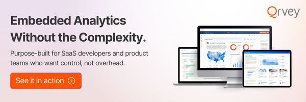
See Qrvey In Action
At some point, analytics stops being internal reporting and becomes part of your product experience, that’s where most BI tools start to break down.
Qrvey is built specifically for that shift. Instead of layering dashboards on top of your app, it lets you embed analytics natively, manage multi-tenant data cleanly, and scale without adding complexity.
You’re creating a data experience that feels like a native part of your product.
If your roadmap includes customer-facing analytics, embedded reporting, or AI-driven analysis, it’s worth seeing how Qrvey works in practice, and how it changes the value your product can deliver.
FAQs
Sometimes. Holistics is better for SQL workflows, while Tableau excels at visualization and enterprise reporting.
It depends. Pricing can scale quickly as usage grows, especially compared to lower-cost tools like Power BI.
Holistics is commonly used by startups and data teams that prefer SQL-based modeling and lightweight BI workflows.
Qrvey offers flat-rate pricing with unlimited tenants, users, datasets, dashboards, etc. You can also deploy as many instances across as many environments/regions as needed at no extra cost. You can find additional details and request specific quotes from our pricing page: https://qrvey.com/pricing/
Natan brings over 20 years of experience helping product teams deliver high-performing embedded analytics experiences to their customers. Prior to Qrvey, he led the Client Technical Services and Support organizations at Logi Analytics, where he guided companies through complex analytics integrations. Today, Natan partners closely with Qrvey customers to evolve their analytics roadmaps, identifying enhancements that unlock new value and drive revenue growth.