5 Best SaaS Analytics Tools in 2026 (Tested & Compared)
 Natan Cohen··33 min read
⚡Key Takeaways
- Qrvey — Best for embedded analytics: Ideal for SaaS companies that need to deliver customer-facing dashboards and analytics directly inside their product.
- Mixpanel — Best for product analytics: Helps teams track user behavior, analyze funnels, and uncover feature adoption trends.
- Amplitude — Best for advanced behavioral insights: Strong for cross-platform journey analysis and predicting churn at scale.
- ChartMogul — Best for revenue analytics: Focused on MRR, churn, and financial health tracking for SaaS businesses.
- Cometly — Best for marketing attribution: Connects ad spend to revenue with server-side tracking for clearer ROI insights.
Choosing the right SaaS analytics platform isn’t as simple as picking “the best platform”, because there isn’t just one type of analytics for SaaS.
Most SaaS companies rely on multiple tools across different use cases, from tracking product usage to analyzing revenue and measuring marketing ROI. What’s often missing, though, is a way to deliver analytics directly to customers as a core part of the product experience.
In this guide, we break down the best SaaS analytics tools in 2026, and segment them by use case. You’ll see what each SaaS analytics software does best, how they compare, and which one fits your specific needs.
Best SaaS Analytics Tools: A Quick Look
| Tool | Best For | Pros | Cons | Starting Price |
|---|---|---|---|---|
| Qrvey | Customer-facing embedded analytics | Built for multi-tenant SaaS environments; fully embeddable; flexible UI & APIs | Not focused on internal analytics use cases | Custom, flat-rate |
| Mixpanel | Product analytics | Strong event tracking; powerful funnels & cohorts; easy for product teams | Not customer-facing | Free |
| Amplitude | Behavioral analytics | Advanced user journey analysis; predictive insights; enterprise-ready | Can be complex to set up | Free |
| ChartMogul | Revenue analytics | Focused SaaS metrics; simple dashboards; easy Stripe integrations | Limited beyond subscription metrics | Free |
| Cometly | Marketing attribution | Server-side tracking; ties ad spend to revenue; strong ROI visibility | Focused on marketing only | Custom |
SaaS analytics is not one category. It’s a stack of tools serving different functions across the business.
Most SaaS companies end up using multiple tools together. But if you’re building a product that needs to deliver analytics externally, you’ll need a dedicated embedded analytics platform.
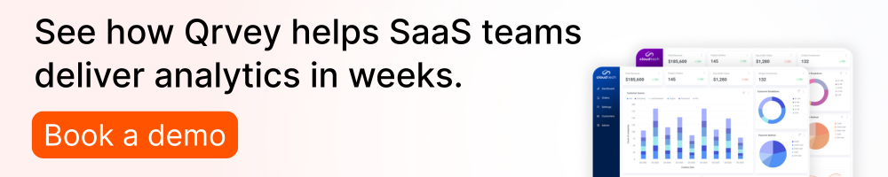
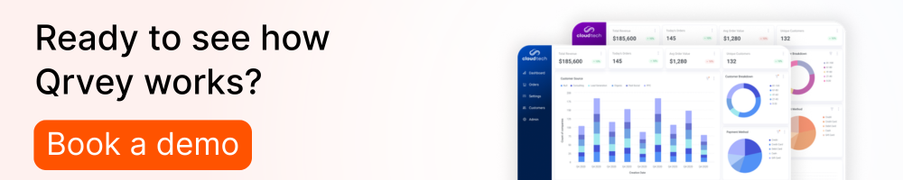
Qrvey: Best Embedded Analytics Platform for SaaS

Qrvey is purpose-built for SaaS companies that need to embed analytics directly into their own applications.
Unlike traditional analytics tools that are designed for internal teams, Qrvey enables you to deliver fully interactive dashboards, reports, and AI-powered insights to your customers, all within your product interface.
This makes it fundamentally different from tools like Mixpanel, Amplitude, or ChartMogul. While those tools help teams analyze internal data, Qrvey focuses on externalizing data.
With a multi-tenant architecture, API-first design, and flexible UI customization, Qrvey is designed to scale with SaaS platforms.
Key features
Qrvey enables customer-facing analytics through a combination of infrastructure, UI flexibility, and data integrations designed for SaaS companies.
Stand Out Feature #1: Multi-tenant architecture
One of Qrvey’s defining capabilities is its built-in multi-tenant architecture, which allows SaaS companies to manage analytics across thousands of customers from a single instance.
Instead of spinning up separate environments or duplicating dashboards for each customer, teams can securely segment data at the tenant level while maintaining a unified backend. This is especially important for SaaS platforms that need to:
- Provide each customer with isolated data views
- Maintain consistent analytics experiences across accounts
- Scale without increasing operational complexity
Product and engineering teams can deploy analytics once and serve many customers, without rebuilding or managing multiple versions.
Compared to internal analytics tools like Mixpanel or Amplitude, which are designed for a single organization’s data, Qrvey’s architecture is specifically optimized for serving external users at scale.
Stand Out Feature #2: Fully embedded dashboards & reporting
Qrvey allows SaaS companies to seamlessly embed dashboards, reports, and visualizations directly into their applications.
Rather than redirecting users to external BI tools or requiring separate logins, analytics becomes a native part of the product experience. This seamless analytics experience improves user adoption, product stickiness, and perceived product value.
Teams can control everything from layout and branding to permissions and interactivity, ensuring that analytics aligns with the overall product UX.
This is a key distinction from traditional BI tools, which often require customization layers to embed effectively.
Stand Out Feature #3: AI-powered analytics capabilities
Qrvey incorporates AI-driven features that help users move beyond static dashboards and toward automated insights and exploration.
Instead of relying on predefined reports, users can:
- Explore data dynamically
- Identify trends and anomalies
- Generate insights without deep technical expertise
This is particularly valuable in customer-facing scenarios, where end users may not be analysts but still need to extract meaningful insights quickly.
By embedding AI into the analytics layer, Qrvey helps SaaS companies deliver more intuitive and accessible data experiences.
Stand Out Feature #4: API-first and developer-friendly

One thing we’ve seen again and again with embedded analytics is this: if the platform doesn’t give your engineering team enough control, it quickly becomes a bottleneck.
Qrvey takes a very different approach. It’s built API-first, which means you’re not trying to fit your product around someone else’s UI, you’re shaping the analytics experience to match how your product works.
From experience, this matters more than it sounds on paper. You’re not just embedding a dashboard, you’re tying analytics into workflows, permissions, customer context, and sometimes even billing logic.
Instead of relying on rigid configurations or prebuilt templates, your team can treat analytics like any other product feature-something you can iterate on, extend, and improve over time.
Compared to internal tools like Mixpanel or Amplitude, where the goal is to explore data within their interface, Qrvey lets you bring analytics fully into your own environment and control how it behaves.
If you’ve ever tried to embed a tool that wasn’t designed for it, you’ll immediately feel the difference here.
Stand Out Feature #5: Data pipeline + analytics in one platform

From our experience, in most analytics setups, data pipeline is one of the hidden layers of complexity that doesn’t get talked about enough.
You’re often stitching together multiple tools of ETL, transformation, storage, then finally visualization, just to get to a usable dashboard. And every additional piece adds friction, maintenance, and potential points of failure.
What most of our customers love about Qrvey is that it pulls a lot of that into a single system. Besides dashboard building, you can handle data ingestion, preparation, and analysis in one place.
For SaaS teams trying to ship customer-facing analytics, that speed matters. You don’t want to spend months wiring together a data stack before you can even start designing the experience.
You can simplify the path to delivering analytics inside your product. And from what we’ve seen, that’s often the difference between analytics being “on the roadmap” and making it into production.
Pricing
| Plan | Pricing |
|---|---|
| Qrvey Pro | Flat-rate |
| Qrvey Ultra | Flat-rate |
Qrvey uses a flat-rate pricing model. It includes unlimited users, dashboards, instances, data and connections.
This pricing model is a much better fit for SaaS companies embedding analytics into their product.

One of the biggest challenges we’ve seen with SaaS data analytics software pricing is unpredictability, especially when costs scale with usage, queries, or the number of end users. That’s fine for internal tools, but it quickly becomes a problem when you are exposing analytics to customers.
Where Qrvey shines
- Built specifically for embedded analytics (not retrofitted):
One of the biggest differences you notice with Qrvey is that it doesn’t feel like you’re trying to force an internal BI tool into a customer-facing use case. Everything is designed for delivering analytics inside your product, not just analyzing data internally. - Scales cleanly as your SaaS business grows:
Because of its architecture and flat-rate pricing model, Qrvey removes a lot of the friction that comes with scaling analytics. You can design once, deploy broadly, and expand usage without worrying about infrastructure or cost constraints catching up to you. - Gives product and engineering teams control and flexibility:
With its API-first approach and flexible embedding capabilities, Qrvey behaves more like a product layer than a standalone tool. Teams can integrate analytics deeply into workflows, customize the experience, and evolve it over time.
Where Qrvey falls short
- Not the right fit for internal-only analytics needs:
If your primary goal is to analyze product usage, track funnels, or monitor internal KPIs, Qrvey is probably more than you need. Tools like Mixpanel or Amplitude are faster to get up and running for internal analytics because that’s exactly what they’re built for. Qrvey adds the most value when analytics is part of your customer-facing product experience. - Requires upfront product and engineering alignment:
From what we’ve seen, you get the most out of Qrvey when there’s a clear vision for how analytics fits into your product. Because it’s flexible and developer-friendly, it doesn’t force you into a predefined setup. But that also means you need to decide how you want to design and deliver the experience.
Customer reviews


From third-party review sites, users consistently call out how intuitive the platform feels for building dashboards and embedding analytics, especially compared to stitching together multiple tools. The ability to pull in data from different sources and automate reporting workflows also comes up a lot.
At the same time, there’s a bit of a trade-off. Some users mention that while the platform is flexible, advanced customization can feel more limited or require thoughtful setup depending on what you’re trying to achieve.
Overall, the takeaway is balanced: Qrvey is easy to work with and powerful in the right use case. You get the most value when you have a clear idea of how you want to implement it.
Who Qrvey is best for
- SaaS platforms adding customer-facing analytics as a product feature:
If you’re building a product where customers expect dashboards, reporting, or data insights, Qrvey is built exactly for that use case. You can embed analytics directly into your product and control the entire experience. - Product teams focused on increasing stickiness and monetization:
Analytics is a way to increase product value. Teams using Qrvey often treat analytics as a differentiator: something that improves retention, enables upsells, or even becomes a revenue-generating feature. - Engineering teams that need flexibility without building everything in-house:
If your team wants control over how analytics is embedded but doesn’t want to maintain a full data + analytics stack, Qrvey strikes a good balance. You get the flexibility to customize and scale, without taking on the overhead of building and maintaining it internally.
Mixpanel — Best for Product Analytics

Mixpanel is a product analytics platform designed to help SaaS teams understand how users interact with their applications. It focuses on event-based tracking, enabling teams to analyze user behavior, measure feature adoption, and optimize product experiences.
Mixpanel is built for internal teams (product, growth, and UX) looking to improve engagement and retention within their own product. It helps you answer: “How are users interacting with our product?”.
Key features
Mixpanel’s core strength lies in its ability to provide detailed visibility into how users move through your product and where they drop off.
Event-based tracking
At the core of Mixpanel is its event-based data model, which tracks specific user actions rather than pageviews. Product teams can monitor granular user interactions (clicks, feature usage, conversions), define custom events tailored to their product, and analyze user behavior at a deeper level than traditional analytics tools.
Compared to tools focused on external analytics delivery (like Qrvey), Mixpanel is designed to answer internal questions about how users behave, not to expose that data to customers.
Funnel and conversion analysis
Mixpanel allows teams to build funnels that track how users move through key workflows—such as onboarding, activation, or checkout.
This helps teams to identify where users drop off, optimize conversion paths, and test improvements to user experience
For example, a SaaS team can track how many users complete the journey of signing up, onboarding and activating key features, and identify friction points in that journey.
This type of analysis is essential for product-led growth, where improving small conversion steps can significantly impact revenue.
User segmentation and cohorts
Mixpanel enables dynamic segmentation based on user behavior and attributes.
SaaS product teams can create cohorts of users and compare behavior across segments to analyze how different groups engage with features.
This segmentation capability helps teams move beyond averages and understand how behavior varies across their user base.
Self-serve dashboards and reporting
Mixpanel includes flexible dashboards that allow teams to create and share insights internally.
These dashboards are easy to configure without engineering support. Mixpanel supports real-time data visualization, enabling collaboration across product, marketing, and leadership teams.
However, these dashboards are typically internal-facing, meaning they are not designed for external customer use cases without additional customization or tooling.
Pricing
| Plan | Pricing |
|---|---|
| Free | Free |
| Growth | Starts at $0 |
| Enterprise | Custom pricing |
Mixpanel offers a free tier, making it accessible for early-stage startups, with pricing increasing based on data volume and advanced capabilities. Enterprise plans typically include enhanced security, governance, and support.
Where Mixpanel shines
- Deep visibility into product usage: What Mixpanel does well is help you understand how people are using your product. Once events are set up properly, you can answer very specific questions, like which features drive retention or where users drop off.
- Strong funnel and retention analysis: You can break down flows step by step and see exactly where things are working (or not). From a product perspective, this is where it really starts to pay off.
- Accessible for product teams: Self-serve dashboards and intuitive UX make it easy for non-technical users to explore data.
Where Mixpanel falls short
- Not built for customer-facing or embedded analytics:
This is probably the biggest limitation depending on your use case. Mixpanel is great for internal analysis, but it’s not designed for exposing that data to end users. If you need analytics inside your product experience, you’ll quickly hit constraints.
- Limited beyond product analytics use cases:
Mixpanel won’t replace tools for revenue analytics, marketing attribution, or embedded reporting. Most teams end up using it as one part of a broader analytics stack.
Customer reviews


Across Mixpanel G2 reviews, the biggest highlight users keep coming back to is how intuitive it feels once you’re up and running. Teams like the ability to explore data, build reports quickly, and understand user behavior without needing SQL or constant help from data teams. Funnel analysis, cohort tracking, and real-time event tracking are especially called out as valuable for improving product decisions.
At the same time, a lot of reviewers call out the learning curve upfront, as well as a steep increase in pricing as usage scales.
Who Mixpanel is best for
- Product teams: Teams focused on improving user experience and feature adoption
- Growth teams: Organizations optimizing conversion funnels and retention
- Early to mid-stage SaaS companies: Especially those using product-led growth models
Amplitude — Best for enterprise-level behavioral analytics

Amplitude Analytics is a product analytics platform built to help teams understand user behavior across web and mobile. It’s designed for internal teams (product, growth, data, and marketing) who want to dig into conversion, adoption, and retention patterns, then act on those insights. Amplitude helps you analyze how your users behave inside your product, rather than delivering analytics dashboards to your customers.
Key features
Cross-platform journey analysis (web + mobile)
A key reason teams choose Amplitude is that it’s built for the reality of modern SaaS: users don’t stay on one platform. They might discover you on desktop, sign up on mobile, then return later in-app. Amplitude’s cross-platform analytics is specifically positioned to help unify behavioral data across platforms so you can see the full path.
In practical terms, this is what makes Amplitude useful for diagnosing “mystery” drop-offs. If you’ve ever looked at a funnel and felt like the story didn’t add up, cross-platform visibility is often the missing piece.
Event-based behavioral analytics
Amplitude is fundamentally event-driven: it’s meant to help you track what users do in your product, then analyze how those behaviors connect to outcomes like conversion and retention.
That’s also why it tends to resonate with teams who are past basic traffic analytics and want product decisions to be grounded in behavior patterns (not pageviews). You can focus on critical moments, like onboarding completion, feature adoption milestones, upgrades, and then segment and compare journeys based on real usage.
Cohorts + segmentation that supports real decision-making
Amplitude’s reviews consistently surface cohorting and segmentation as core value drivers. On the G2 pros/cons rollup, users highlight ease of access to data without coding skills and strong reporting, while still noting the learning curve for new users.
Cohorts turn analytics into something you can act on. Instead of asking “did retention drop?”, you’re asking “which user segments dropped, and what behaviors predict that change?” That’s the difference between analytics as reporting and analytics as decision support.
AI-assisted exploration + automated surfacing of trends
Amplitude positions its platform around AI-assisted exploration and surfacing insights. It emphasizes self-serve exploration with “simple AI prompts” and AI Agents that surface trends and unexpected behaviors.
This is especially helpful when you’re trying to reduce the dependency on one person who “knows analytics.” The goal is to let more of the team explore questions without everything routing through an analyst—while still maintaining governance and structure as you scale.

Pricing
Amplitude offers a free Starter option and paid tiers that scale with needs. Starter is free; Plus starts at $49/month (annual billing), while Growth and Enterprise are listed as custom via sales.
| Plan | Pricing |
|---|---|
| Starter | Free |
| Plus | $49/month |
| Growth | Custom pricing |
| Enterprise | Custom pricing |
Where Amplitude shines
- Cross-platform journey clarity: If you care about how users move between web and mobile, Amplitude’s cross-platform analytics is built for that problem, not as an afterthought.
- Strong behavioral insights for product decisions: Reviews highlight powerful insights, reporting, and the ability to visualize and access data without coding, especially valuable for product teams trying to move fast.
- Self-serve analytics at scale: Amplitude’s positioning around AI prompts, AI Agents, and governance suggests it’s designed to reduce bottlenecks while still supporting structure as more teams rely on analytics.
Where Amplitude falls short
- Steep learning curve: Even though many users describe the product as user-friendly, the G2 pros/cons summary repeatedly calls out that Amplitude can feel challenging for beginners and requires time to learn well.
- Cost can become a concern at paid tiers: Review rollups also mention Amplitude being expensive—especially once teams move beyond the free tier—so pricing scalability is something to watch as your tracked usage grows.
Customer reviews


Across G2 sentiment, users frequently praise Amplitude for delivering fast, “instantaneous” insights and strong dashboards/reporting that help them understand behavior efficiently.
On the flip side, recurring criticism centers on the steep learning curve (especially for teams new to instrumentation and analysis) and concerns that the product can feel expensive depending on tier and usage. Some reviewers also mention limited customization flexibility in certain reporting or setup areas.
Who Amplitude is best for
- Enterprise SaaS product teams who need deep behavioral analytics across web + mobile journeys
- Growth and lifecycle teams focused on conversion, retention, and adoption insights
- Data-driven orgs that want self-serve exploration with governance as usage scales
ChartMogul — Best for SaaS revenue analytics

ChartMogul is a revenue analytics platform built specifically for subscription-based SaaS businesses. It focuses on helping teams understand metrics like MRR, churn, expansion, and customer lifetime value.
ChartMogul is designed to answer a different set of questions: how your business is performing financially and how revenue evolves over time. It’s a tool used primarily by founders, finance, and growth teams to monitor subscription health and make revenue-driven decisions.
Key features
ChartMogul’s strength is its focus. Everything is built around helping you understand how your SaaS business is performing from a revenue lens.
MRR and subscription metrics tracking
One of the biggest things ChartMogul simplifies is tracking core SaaS metrics without second-guessing the numbers.
Instead of maintaining spreadsheets or stitching data together manually, you get consistent tracking for: monthly recurring revenue (MRR), churn (customer and revenue churn), expansion revenue (upsells, upgrades), net revenue retention (NRR).
This is the foundation most teams struggle to get right internally. Having a system that calculates these metrics consistently and updates them automatically, removes a lot of ambiguity, especially when different teams (finance, product, leadership) are looking at the same numbers.
Revenue segmentation and cohort analysis
Where ChartMogul starts to become more useful is when you move past “what’s our MRR?” and start asking why it looks the way it does.
It allows you to break down your revenue by different dimensions: plan type, customer segment, geography, acquisition channel.
You can track how groups of customers behave over time—not just in terms of usage (like product analytics tools), but in terms of revenue contribution and retention.
Recurring revenue forecasting
ChartMogul includes forecasting capabilities that help teams project future revenue based on historical trends.
For early-stage companies, this can be a way to build confidence in projections. For more mature SaaS businesses, it becomes part of financial planning and reporting to stakeholders or investors.
Integrations with billing systems
One of the reasons ChartMogul works well for SaaS companies is that it integrates directly with billing platforms like Stripe and similar tools.
ChartMogul plugs into your existing billing workflow, allowing you to sync subscription data automatically, avoid manual data entry, keep reporting consistent across systems.
Simple dashboards for non-technical teams
Compared to product analytics tools, ChartMogul is intentionally simpler in its interface.
You’re not building complex event-based queries. Instead, you’re working with predefined SaaS metrics and dashboards. This makes it easier for founders, finance leaders, and growth teams to access and understand revenue performance without needing a data background.
Pricing
ChartMogul offers both free and paid plans, typically based on the amount of tracked revenue and feature access.
A free plan is available for startups, while paid tiers expand with more advanced reporting and capabilities. Pricing generally scales with business size and complexity, making it accessible early on but growing alongside your SaaS revenue trajectory.
| Plan | Pricing |
|---|---|
| Free | $0 |
| Starter | $59/month |
| Pro | $99/month |
| Enterprise | From $19,900 |
Where ChartMogul shines
- Built specifically for SaaS revenue metrics:
ChartMogul focuses on the metrics that matter for subscription businesses, including MRR, churn, and retention, without requiring teams to build models from scratch. - Clear visibility into financial performance:
It takes complex revenue data and makes it easy to understand, which helps teams make faster, more confident decisions. - Fast setup with billing integrations:
Because it integrates directly with tools like Stripe, teams can get meaningful insights without spending weeks building data infrastructure.
Where ChartMogul falls short
- Limited to revenue analytics use cases:
ChartMogul is highly focused, which is great, but also limiting. It won’t help you understand product usage, user behavior, or marketing attribution. - Not designed for deep customization:
Compared to more flexible analytics tools, ChartMogul is opinionated. You get standardized metrics and dashboards, but less flexibility if you want to build highly custom analyses.
Customer reviews


Across customer feedback, ChartMogul is generally valued for its simplicity and focus. Users consistently highlight how easy it is to track subscription metrics and understand revenue performance without building complex reports.
At the same time, some feedback points to limitations in flexibility, particularly for teams that want to go beyond standard SaaS metrics or combine revenue data with deeper product or marketing insights.
Who ChartMogul is best for
- SaaS founders and leadership teams tracking growth, churn, and revenue performance
- Finance and RevOps teams managing subscription metrics and forecasting
- Early to mid-stage SaaS companies that want simple, reliable revenue analytics
Cometly — Best for marketing attribution and ad performance

Cometly is a marketing analytics platform focused on attribution and performance tracking, helping SaaS companies understand how their marketing efforts translate into revenue.
While tools like Mixpanel and Amplitude focus on product usage, and ChartMogul focuses on revenue metrics, Cometly sits earlier in the funnel.
It’s primarily used by marketing, growth, and RevOps teams to connect ad spend directly to business outcomes and improve ROI visibility.
Key features
Cometly is built around one core goal: helping teams clearly understand where revenue is coming from, especially in environments where attribution is often messy or incomplete.
Multi-touch attribution across channels
One of the biggest challenges in marketing analytics today is that the customer journey is rarely linear.
A typical SaaS buyer might click an ad, read a blog post, join a webinar, convert weeks later.
Cometly helps track and connect these touchpoints, giving teams a multi-touch attribution view rather than relying on last-click or first-click models.
This changes how teams think about performance. Instead of over-crediting a single channel, you get a more realistic view of how different campaigns contribute to conversion.
Revenue-level attribution (not just clicks and leads)
What stands out with Cometly is that it goes beyond basic marketing metrics like impressions or clicks.
It connects marketing data directly to conversions, pipeline, revenue
This is important because a lot of marketing tools stop at “leads generated.” Cometly helps answer the harder question: which campaigns actually drive revenue, not just activity?
For SaaS teams, this allows for more accurate ROI measurement, better budget allocation decisions, stronger alignment between marketing and sales.
Server-side tracking for more reliable data
One recurring challenge in attribution is data reliability, especially with browser restrictions, ad blockers, and privacy changes.
Cometly uses server-side tracking, which helps improve data accuracy, tracking consistency across devices, and attribution reliability.
There are fewer gaps in your reporting and more confidence in your numbers.
Integration with ad platforms and CRM systems
Cometly integrates with common advertising platforms (like Meta and Google Ads) and CRM systems, allowing you to connect campaign data with customer and revenue data.
This creates a more unified view of ad performance, funnel progression, and revenue outcomes
Instead of switching between tools, teams can analyze marketing performance in one place.
Real-time dashboards and performance reporting
Cometly includes dashboards that allow teams to monitor performance as it happens.
You can track campaigns in real time, identify top-performing channels, and adjust spend or strategy quickly.
Compared to static reporting, this makes it easier to move faster, especially in performance-driven marketing environments where timing matters.
Pricing
Cometly uses a custom pricing model based on factors like usage, tracking requirements, and overall scale.
Pricing is typically tailored to the needs of the business, with different levels depending on campaign complexity and data volume. As with most attribution platforms, costs tend to scale with usage and data tracking requirements.
| Plan | Pricing |
|---|---|
| Core | Custom pricing |
| Enterprise | Custom pricing |
Where Cometly shines
- Clear connection between marketing spend and revenue:
One of the biggest advantages is being able to tie campaigns directly to revenue outcomes—not just leads or clicks. That clarity is hard to achieve with standard marketing tools. - Improved attribution accuracy with server-side tracking:
As tracking becomes more fragmented, server-side approaches help maintain data reliability and reduce blind spots. - Stronger alignment between marketing and business outcomes:
Cometly helps shift conversations from “how many leads did we generate?” to “what actually drove revenue?”, which is ultimately what matters for growth.
Where Cometly falls short
- Focused only on marketing analytics:
Cometly is strong in attribution, but it doesn’t cover product analytics, revenue analytics, or customer-facing reporting. It’s one piece of the stack, not a full analytics solution. - Requires solid data integration to be effective:
Like most attribution tools, the value depends heavily on how well your data sources are connected. Without good integration across ads, CRM, and conversion tracking, insights can be limited.
Customer reviews


Across customer feedback, Cometly is generally appreciated for making attribution more transparent and easier to understand, especially for teams managing paid acquisition.
Users often highlight its ability to connect ad spend to real business outcomes and provide clearer performance insights compared to standard ad platform reporting.
At the same time, some feedback reflects the typical challenges of attribution tools, particularly around setup, integration, and ensuring data accuracy across systems.
Who Cometly is best for
- Marketing and growth teams focused on paid acquisition and ROI optimization
- SaaS companies running multi-channel campaigns across ads, content, and outbound
- RevOps teams aligning marketing performance with pipeline and revenue
How to Choose the Right SaaS Analytics Tool
Choosing the right SaaS analytics tool starts with one simple question: what decision are you trying to make?
The biggest mistake I see teams make is trying to find a single tool that does everything. In reality, SaaS analytics is a stack, and each category exists to answer a different type of question.

Feature Consideration #1: Who is the analytics for?
This is the fastest way to narrow the field. If analytics is primarily for internal decision-making, you’ll prioritize event tracking, funnels, retention, and segmentation (product analytics), or MRR/churn dashboards (revenue analytics). But if analytics is meant to be part of your product experience, you’re playing a different game: permissions, UX consistency, multi-tenant security, and embedding become non-negotiable.
We like to sanity-check this with a simple question: Will a customer log into this and expect it to feel like part of our app? If yes, don’t force-fit an internal analytics tool into a customer-facing use case, you’ll spend more time patching the gaps than you expect.
If you’re delivering analytics to customers, Qrvey is built for embedded, multi-tenant, customer-facing analytics as its core use case.
VIDEO: Where Should SaaS Teams Start with Self-Service Analytics?
Feature Consideration #2: Can it handle your data reality?
Before you fall in love with dashboards, get brutally practical about data. Where does truth live—warehouse, app DB, billing system, CRM, product events? Some tools assume you’ll instrument everything as events; others assume clean subscription objects; others rely on connecting multiple sources and normalizing them.
If your goal is customer-facing analytics, you want a platform that can sit cleanly between your data sources and your embedded experience, without rebuilding everything from scratch each time requirements change. Qrvey is designed for that “analytics layer” role in SaaS products.

Feature Consideration #3: Implementation effort vs. time-to-value
Every analytics tool comes with a hidden tax: setup. Product analytics requires disciplined event planning and instrumentation. Revenue analytics requires clean billing mappings and consistent plan logic. Attribution requires tight tracking and conversion hygiene.
We’ve found the best decision happens when you’re honest about your constraints. If you have a small engineering team, you may prefer faster setup and opinionated defaults. If you have strong data resources, you can afford more customization.
Either way, avoid tools that require “perfect data” before you can get value—because perfect data rarely exists on day one.
For embedded analytics, Qrvey is positioned as a way to avoid the long build cycle of creating a customer-facing analytics layer internally.
Feature Consideration #4: Scalability + cost predictability
This is where many teams get surprised. Some tools price by events, tracked users, or data volume, which can be fine internally, but gets risky when analytics adoption becomes a success story. If customers love dashboards (good!), you don’t want your costs to spike simply because your product is working.
So look at pricing through a SaaS lens: Can I grow customers, seats, and usage without breaking unit economics? Also consider operational scale: multi-tenant security, role-based access, and the ability to deploy changes reliably without rebuilding per customer.
For SaaS teams embedding analytics, cost predictability and multi-tenant scale become part of the product strategy, not just a tooling decision.

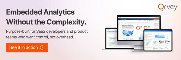
Deliver AI-Powered Analytics to Every Customer — Without the Build Cost
For SaaS teams, there’s a growing expectation that analytics isn’t just internal, it’s part of the product experience.
Customers don’t just want access to data. They expect interactive dashboards, self-serve reporting, and AI-driven insights.
The challenge is that building this in-house is slow, expensive, and hard to scale, especially in a multi-tenant environment.
This is where embedded analytics platforms like Qrvey come in. Instead of building and maintaining your own analytics layer, you can embed fully functional dashboards directly into your product, deliver AI-powered insights to every customer and scale across tenants without rebuilding infrastructure.
What we’ve seen is that this shifts analytics from being a “nice-to-have” to a core product feature, something that improves retention, increases perceived value, and even creates new monetization opportunities.
If you’re thinking about adding analytics to your product, it’s worth taking a closer look at how embedded analytics works in practice. Book a demo with Qrvey.
FAQs
Qrvey is a fully deployed solution, therefore Customer hosts all Qrvey resources and components. Qrvey deploys into Customer’s cloud account(s) directly in either AWS or Azure.
Yes, dashboard builders who belong to the primary SaaS organization can build role-based custom dashboards and deploy them to all tenant end users who have the matching role.
Qrvey offers flat-rate pricing with unlimited tenants, users, datasets, dashboards, etc. You can also deploy as many instances across as many environments/regions as needed at no extra cost. You can find additional details and request specific quotes from our pricing page: https://qrvey.com/pricing/
The Qrvey dashboard and visual analytics platform provides a seamless integration with Snowflake’s serverless architecture. And Qrvey offers both live and cached connectivity modes to Snowflake.
Natan brings over 20 years of experience helping product teams deliver high-performing embedded analytics experiences to their customers. Prior to Qrvey, he led the Client Technical Services and Support organizations at Logi Analytics, where he guided companies through complex analytics integrations. Today, Natan partners closely with Qrvey customers to evolve their analytics roadmaps, identifying enhancements that unlock new value and drive revenue growth.