Analytics are boring…
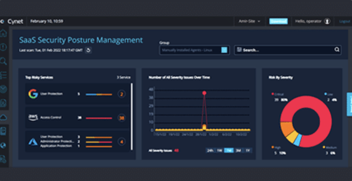
Visualizations are yesterday’s news… who uses dashboards anyway? If you’re like most product managers, analytics, dashboards and visualizations may seem like “just another feature” you need to have, but under-investing in this critical element of your application could put you at a competitive disadvantage you’re not even aware of. Dashboards and visualizations often seem less exciting and marketable than artificial intelligence or process automation. That’s why many companies are content to just build their own reporting capabilities using free libraries such as high charts or D3. These free libraries are powerful and continually improving, but they are very developer-heavy, they lack self-service capabilities and they offer minimal white labeling. There’s also no dedicated support available beyond just posting to the general community. But delivering inferior capabilities doesn’t matter, right? It’s just analytics, after all. In fact, most software vendors use these features as a key value driver. How do we know? Because almost everywhere you look, software vendors have positioned these capabilities as a key component of their product on their websites. Pick any software category, then stop by any software review site for the top vendors in that category and you’ll find websites replete with mentions of analytics as a key part of their user experience. For many, even their pricing tiers are built around analytics features. To understand the role analytics plays in software, we randomly selected a category of applications on G2 Crowd and then analyzed the product positioning of the top 5 vendors. The first category we evaluated was Cyber Security – Managed Detection and Response (MDR) Software. The top five vendors included Huntress, Cynet 360, Arctic Wolf, Blackpoint and Alert Logic.
- Unique Visuals. Dashboards that went well beyond simply pie charts or combo charts and featured custom visualizations which are difficult to find in open source libraries.
- Custom Reporting. Powered by self-service analytics – which requires a higher tier of pricing – often at the enterprise level – driving additional revenue.
- Actionable Data. Some vendors touted how data was not passive, and how interacting with it could kick off workflows or actions.
Tier 1 – Pre-canned reports
These are typically basic reports and dashboards that offer information deemed most important by the software vendor. Sometimes they have more advanced visualizations and feature filtering to make the reports more useful but the end-user gets what’s defined in the application and nothing more.Tier 2 – Self-service capabilities
The application provides all of the above but also allows the end user to select from a library of chart types, connect to the data they deem necessary, establish parameters, and add these visualizations to a custom or pre-defined dashboard.Tier 3 – Custom reports created by a ProServe team
Focused primarily on enterprise customers, professional services offer white glove treatment where they will use the platform (or enlist dev teams to use a code-heavy backend) to build and deploy reports on behalf of clients. This tier of service is typically very expensive but can be high margin if the platform is easy to use and lower-cost employees can field these inbound requests. This tier can be done in conjunction with Tier 2. Finally, while a dashboard shows data, the most powerful dashboards allow end users to take action on that data directly from the interface. This requires more than just charts and graphs but a platform that has built-in automation capabilities, the ability to create custom workflow interactions based on your defined user experience, and the ability to write data back to the database. Increasingly, this is where analytics will differentiate. Selecting a vendor with a strong roadmap in this area is critical because delivering an improved analytics experience will be the future of your application. What we have seen in our extensive software reviews is that visualizations and dashboards actually DO matter. And they matter a lot more than you might think. Many vendors even named their dashboards in a compelling way. So, yes, visualizations are just another feature. But they’re also just another feature that can differentiate your product. Just another feature that can reduce churn. And just another feature that can drive new revenue. That sounds like “just another feature” worth investing in and one that should be at the top of your priority list. Discover more by digging deeper into what is embedded analytics or learn more about Qrvey’s leading embedded analytics platform here.
As a Senior Content Writer, Megan collaborates with Qrvey’s subject matter experts to develop business and technical content supporting SaaS product managers and developers. Megan has over 25 years’ experience writing about data, analytics, security, and other IT topics. When not behind a computer screen, Megan teaches group fitness classes and gallivants around Maryland’s woods hiking, mountain biking, and foraging.
Popular Posts
Why is Multi-Tenant Analytics So Hard?
BLOG
Creating performant, secure, and scalable multi-tenant analytics requires overcoming steep engineering challenges that stretch the limits of...
How We Define Embedded Analytics
BLOG
Embedded analytics comes in many forms, but at Qrvey we focus exclusively on embedded analytics for SaaS applications. Discover the differences here...
White Labeling Your Analytics for Success
BLOG
When using third party analytics software you want it to blend in seamlessly to your application. Learn more on how and why this is important for user experience.


