⚡Key Takeaways
- A JS chart library uses pre-built JavaScript code to transform raw data into visual formats like bar graphs and line charts
- Your library choice directly impacts performance—the wrong one freezes browsers when customers filter large datasets
- For SaaS teams, ready-made solutions like Qrvey beat spending months building chart components that don’t differentiate your product
Most SaaS teams approach charting backwards. They pick a JS chart library, start building, then hit roadblocks on data security, multi-tenant isolation, and performance optimization simultaneously. This pattern kills roadmaps because libraries solve rendering, not the hard problems around it.
This guide shows you the five chart libraries that actually matter in 2026, which one handles your data volume without choking, and when buying beats building every single time.
What is a JS (JavaScript) Chart Library?
A JS chart library is a pre-built toolkit that converts your data into visual formats like bar graphs, line charts, or heat maps using JavaScript libraries that run in web browsers.
Instead of manually drawing each axis, plot point, and legend with raw code snippets, you feed data into the library’s API. The library handles rendering through SVG rendering, HTML5 Canvas, or WebGL, depending on its architecture.
How JS Chart Libraries Work
JavaScript charting libraries operate through a straightforward pipeline that turns your data into pixels on screen.
Here’s the typical workflow:
- Data ingestion: You pass your dataset (arrays, JSON objects, or connections to data sources) into the library’s initialization function
- Configuration: You specify chart types, colors, axes ranges, tooltips, and interaction behaviors through the library’s API
- Rendering engine: The library uses HTML5 Canvas, SVG rendering, or WebGL to draw visual elements
- Interactivity layer: Event listeners enable hover tooltips, click drilldowns, zoom controls, and real-time updates as your underlying data changes
- Responsive design: Modern libraries automatically recalculate dimensions when browser windows resize or mobile platforms load the page
The real difference between libraries shows up in how they handle scale. When you’re building something like embedded analytics for multiple external customers, think beyond just rendering one chart.
You need multi-tenant security, data isolation, and performance that holds up when 50, 100, even 1,000 customers load dashboards simultaneously. This is something purpose-built solutions like Qrvey’s embedded analytics platform handle by default.
Why Use a JS Chart Library?
Building charts from scratch means solving problems that smarter teams already solved years ago.
Speed to Market
Every hour your developers spend debugging axis labels is an hour they’re not building the workflow automation or data integration that actually makes customers choose your product over competitors.
A charting library gives you production-ready bar charts and line graphs in hours instead of quarters.
Performance You Can’t Replicate Easily
Approximately 402.74 million terabytes of data are created daily.
Your users expect live charts that handle this volume without freezing their browser tabs.
Libraries like LightningChart optimize rendering pipelines using GPU acceleration, work that took their engineers years to perfect. According to their benchmarks, they process datasets 15,570 times larger than many competing libraries.
Could your team build that level of optimization? Probably. Should you spend the next year building while customers really want self-service analytics? Can you afford the volume of real-time queries from your data warehouse like Snowflake? That gets pricey real fast. All questions to seriously consider.
Cross-Browser Compatibility
Testing responsive layouts across Chrome, Safari, Firefox, and mobile platforms is tedious work that never shows up in your product demos.
Mature libraries already fixed the rendering bugs you haven’t discovered yet. They handle quirks like Safari’s stricter memory management and mobile touch interactions that feel different from mouse clicks.
Focus Time on What Differentiates You
Your customers are buying the core workflow, unique algorithm, or integrations your competitors don’t offer.
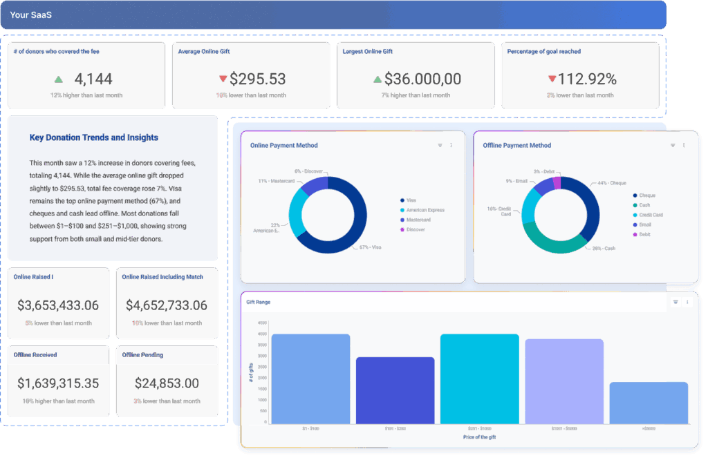
Companies like Qrvey provide embedded analytics for SaaS applications with pre-built charts and self-service dashboards, transforming analytics into a competitive advantage without consuming your roadmap.
Consider this: If building better charts doesn’t directly increase your net dollar retention, maybe it’s time to let someone else handle that complexity.
What Are the Most Popular JS Chart Libraries?
These five libraries represent the spectrum from beginner-friendly simplicity to GPU-powered performance monsters.
Chart.js
Chart.js is what you reach for when you need beautiful results without reading 200 pages of documentation first.
Framework
Built on Canvas with open-source code, Chart.js works with vanilla JavaScript or integrates into React, Vue, and Angular. The modular design lets you tree-shake unused components, shrinking bundle size from 48KB down to 14KB when you only need basic bar charts.
Key Features
- Eight core chart types including bar, line, pie, and scatter plots with smooth animations
- Responsive scaling that works across desktop and mobile without manual calculations
- Mixed chart types on a single canvas for comparing trends across different data series
Pros
- Setup takes minutes: paste a code snippet, pass your data, and you’re rendering
- Performance stays solid across modern browsers
Cons
- Large datasets (100,000+ points) can cause frame rate drops since Canvas repaints everything on updates
- Limited built-in interactivity like zoom controls
Customer Review
“The biggest pro in my opinion to chart.js is how easy it is to implement and how little effort it takes to get a nice looking chart.” – Verified G2 User
When It Makes Sense
If you’re prototyping a new feature and need to show stakeholders interactive mockups by Friday, Chart.js delivers. But when users start filtering through 500,000 transaction rows in real-time, you might hit walls.
Luckily, GPU-accelerated alternatives or purpose-built platforms like Qrvey’s embedded data visualization components handle the heavy lifting without custom optimization work.
LightningChart JS
When your IoT dashboard needs to plot two million sensor readings without lag, most libraries fall apart. LightningChart JS was built specifically for scenarios where performance isn’t negotiable.

Framework
This WebGL-rendered library leverages GPU acceleration across web, mobile, desktop, and cloud applications. It integrates with React, Angular, and other frameworks while maintaining framework-agnostic core functionality.
Key Features
- 100+ chart types from traditional bar graphs to specialized financial charts
- Handles up to two billion data points with rendering speeds dramatically faster than Canvas alternatives
- Real-time data streaming with automatic updates as new values arrive
Pros
- Performance is blazing for applications with constant updates
- Documentation includes 200+ examples and 10+ project templates
Cons
- Learning curve is steeper because WebGL concepts require more initial understanding
Customer Review
“Precise and comprehensive charts to express large volumes of data with remarkable rendering capabilities are made possible by the library. It is sometimes difficult to navigate the charts on the small scale of the screen.” – Verified G2 User
When It Makes Sense
Financial platforms with live tick-by-tick price movements, industrial monitoring dashboards, or scientific applications where researchers scrub through millions of measurements all justify LightningChart’s complexity.
CanvasJS
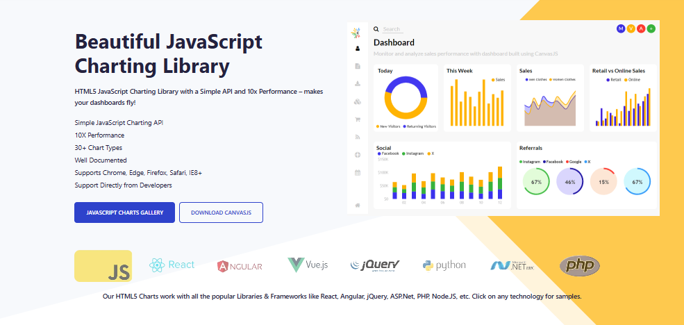
CanvasJS sits between ease of use and commercial-grade polish, making it popular for teams that need reliable results without becoming charting specialists.
Framework
Built on Canvas with cross-framework compatibility, CanvasJS renders across React, Angular, jQuery, and backend frameworks like ASP.NET and PHP. The simple API means configuration stays manageable.
Key Features
- 30+ chart types including stock charts with built-in financial indicators
- Renders 100,000 data points in milliseconds while maintaining smooth interactions
- Built-in zooming and panning without plugins
Pros
- The smooth learning curve makes it approachable for both designers and developers
- Default styling looks professional without custom CSS
Cons
- Documentation sometimes requires digging to find advanced options
- Licensing costs adds up across multiple projects
Customer Review
“The tool is very good and very useful its only negative point is its high cost” – Verified G2 review
When It Makes Sense
For product teams building customer-facing dashboards where visual polish matters and budgets allow for commercial licensing, CanvasJS delivers results without requiring specialized charting expertise on your team.
But if you’re embedding white-label analytics into your product and serving thousands of tenants, licensing costs multiply; a scenario where platforms like Qrvey’s unlimited deployment model becomes more economical.
Highcharts
Trusted by 80 of the world’s 100 largest companies, Highcharts proves itself in enterprise environments where reliability matters more than cutting-edge features.

Framework
Highcharts supports React, Angular, Vue, Python, R, and mobile platforms through official wrappers. It renders using SVG for crisp scaling and accessibility.
Key Features
- Comprehensive chart types plus specialized modules for maps, stock analysis, and Gantt diagrams
- Extensive customization covering every visual element from axis labels to tooltip formatting
- Built-in interactivity with tooltips, zooming, and drilldown capabilities
Pros
- Setup is developer-friendly with clear API patterns
- Performance stays solid despite SVG overhead
Cons
- Commercial licensing is required for business use
- The library can feel heavy for simple use cases where you only need basic bar charts
Customer Review
“It is easy to implement, works reliably with large datasets, and offers good customization options to match our design. The many options can make the initial setup take some time for new users.” – Verified G2 review
When It Makes Sense
If you’re building enterprise analytics where stakeholders expect familiar chart types and bulletproof reliability, Highcharts delivers without surprises.
Pro Tip: When evaluating chart libraries, test with your actual data volume. A library that renders 10 sample charts beautifully might struggle with 50 real-world dashboards loading simultaneously.
AnyChart
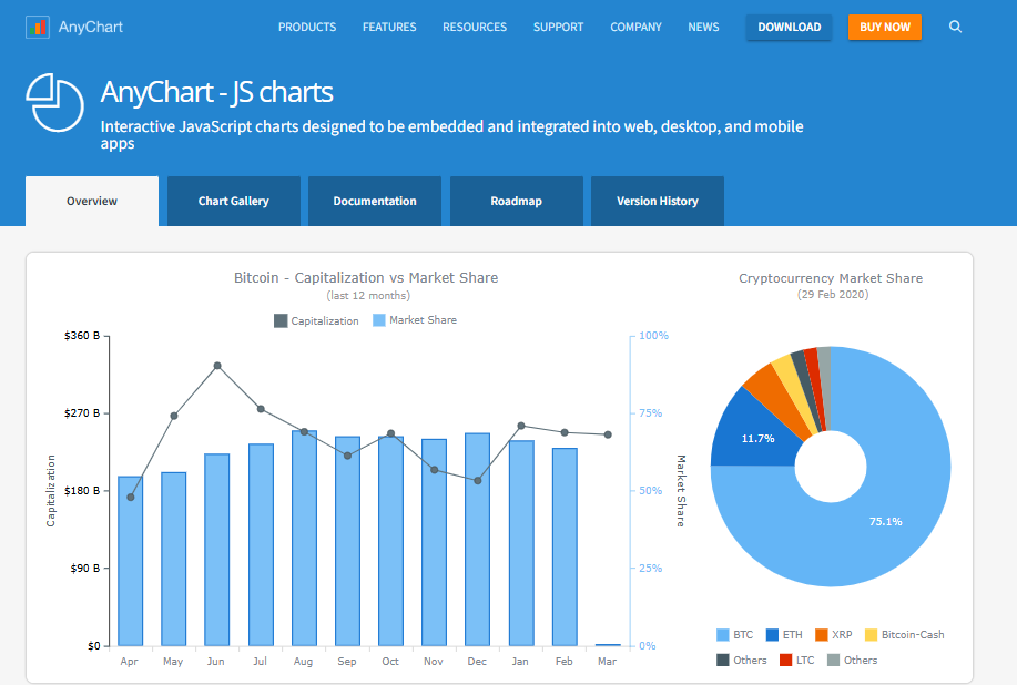
Developed continuously since 2003, AnyChart brings over two decades of maturity to JavaScript charting.
Framework
This lightweight library works with any database and platform through framework-agnostic design. The open-source codebase provides transparency while commercial licenses fund development.
Key Features
- 69 chart types spanning standard visualizations to specialized Gantt and stock charts
- Multi-language support covering 194 locales for international deployments
- Export to PDF, PNG, JPG, SVG, Excel, and CSV formats
Pros
- AnyChart creates interactive dashboards with minimal coding
- Cross-browser support handles legacy environments gracefully
Cons
- Some users report difficulty determining optimal data structures for complex visualizations.
Customer Review
“I like that you can interface with other computer language using Anycharts. I did not like that you could export the data from the platform.” – Verified G2 review
When It Makes Sense
Established enterprises building internal business intelligence tools or government agencies requiring accessibility compliance get value from AnyChart’s maturity.
How to Choose the Right JavaScript Chart Library
Picking the best library requires matching capabilities to your specific constraints and user needs.
Your Team’s Expertise and Timeline
If your roadmap shows “analytics dashboard” launching in six weeks and your team hasn’t written a single line of charting code yet, simplicity beats power.
Also, consider what your team shouldn’t be learning. Data visualization expertise isn’t your competitive advantage if you sell project management software, just table stakes your customers expect.
That’s exactly why platforms like Qrvey exist: to let your developers focus on core product features instead of becoming charting specialists.
Cheat Code: Check out this comprehensive guide for creating stunning data visualizations (includes best practices and data visualization examples to steal).
Consider Long-Term Maintenance
Check GitHub commit history, not just star counts. An unmaintained library with 50,000 stars becomes a liability when security vulnerabilities appear and no one fixes them.
Framework integration matters more than teams anticipate. If you’re building in React and choose a library with only jQuery examples, you’ll spend days wrapping it properly. Libraries built in your framework eliminate that translation layer but lock you into that ecosystem.
Pro Tip: Use our ROI calculator to compare total costs of building analytics in-house versus buying a purpose-built solution.
Prioritize Customization That Matters
Sure, there are plenty of SaaS users that don’t need bespoke data visualizations. They need bar charts that load quickly, filters that work intuitively, and exports that don’t corrupt files. If your requirements match 90% of what a library provides out-of-box, customize the remaining 10% with CSS rather than starting from primitives.
For customer-facing analytics where branding matters, look for white-label capabilities that let you customize every visual element without wrestling with code in 47 different files.
Video: See how SaaS teams are customizing charts and themes with Qrvey in this product tutorial.
Common Challenges & How to Overcome Them
Even the best JavaScript charting library can introduce headaches you didn’t anticipate during evaluation.
Lack of Responsive Layouts
Many libraries claim responsive design but implement it inconsistently. Charts expand endlessly in CSS grid containers, tooltips get clipped by overflow-hidden parents, or legend positions break at specific breakpoints.
So, test across actual devices, not just browser DevTools simulators. If responsive charting consumes more than a few days of debugging, you might be solving the wrong problem.
Performance Degradation in Production
Your demo loaded 1,000 clean rows instantly. Production grinds to a halt with 15,000 messy ones and the culprit is usually progressive rendering failures.
Solutions depend on architecture. For Canvas libraries, implement data windowing that only renders visible points. For SVG libraries, consider switching to Canvas for high-frequency updates.
Multi-Tenant Data Isolation
Most JavaScript libraries render whatever data you pass, which means your application code must enforce isolation perfectly always.
One mistyped variable and you’ve created a data breach.
Secure approaches require server-side filtering that validates tenant context on every query. This is straightforward architecturally but tedious to implement correctly across every component.
Or you use a multi-tenant platform like Qrvey where isolation is architectural rather than hoping developers never forget security checks: the approach that let JobNimbus scale to 6,000 customers without data leakage incidents.

A Quick Note On Qrvey
Building charts is the easy part. Building secure, scalable, multi-tenant analytics that customers love takes years—time most SaaS teams don’t have.
Qrvey eliminates months of development by giving you a complete embedded analytics platform that deploys to your cloud in days. Your customers get self-service dashboards they can customize and engineers get hundreds of hours back for features that differentiate your product.
Companies like JobNimbus proved this approach works: 70% adoption, reduced churn, and enterprise customers who stay because analytics match the quality of their core product.
Try Qrvey’s turnkey solution for production-ready data visualization and workflow automation without hiring a data engineering team

Natan brings over 20 years of experience helping product teams deliver high-performing embedded analytics experiences to their customers. Prior to Qrvey, he led the Client Technical Services and Support organizations at Logi Analytics, where he guided companies through complex analytics integrations. Today, Natan partners closely with Qrvey customers to evolve their analytics roadmaps, identifying enhancements that unlock new value and drive revenue growth.
Popular Posts
Why is Multi-Tenant Analytics So Hard?
BLOG
Creating performant, secure, and scalable multi-tenant analytics requires overcoming steep engineering challenges that stretch the limits of...
How We Define Embedded Analytics
BLOG
Embedded analytics comes in many forms, but at Qrvey we focus exclusively on embedded analytics for SaaS applications. Discover the differences here...
White Labeling Your Analytics for Success
BLOG
When using third party analytics software you want it to blend in seamlessly to your application. Learn more on how and why this is important for user experience.
