2026 Embedded Data Visualization: Benefits, Tools & Use Cases
 Natan Cohen··15 min read
⚡Key Takeaways
- For multi-tenant SaaS platforms, embedded visualization is not just a reporting feature. It directly impacts customer retention, product adoption, renewal rates, and even infrastructure costs when designed correctly
- The best embedded data visualization tools in 2026 support white-labeling, tenant-level security, self-service dashboard building, cloud-native deployment, workflow automation, and generative AI capabilities
- Platforms like Qrvey stand out because they were built specifically for multi-tenant SaaS environments instead of general purpose bi tools adapting their analytics products after the fact
Nothing exposes weak SaaS infrastructure faster than customer-facing dashboards running against live production systems. One large customer starts filtering reports all day, your Snowflake bill spikes, and suddenly your application slows down during peak usage.
Embedded data visualization fixes this by separating analytics workloads from core application performance while keeping dashboards fully integrated inside your product experience.
This guide breaks down how embedded visualization works, the tools leading SaaS teams use, and the architecture decisions that matter for multi-tenant scale.
What Is Embedded Data Visualization?
Embedded data visualization means building interactive charts, dashboards, and reports directly inside a software product so users analyze data without leaving the app.
The key word is interactive. Unlike a PDF export or a static chart, an interactive visualization lets users filter, drill down, and follow up, without a data analyst in the loop.

Users now expect analytics to behave like the rest of the application. If your customers log in and immediately export to Google Sheets, your analytics isn’t earning its place in the product and interactive visuals are what change that.
How Does Embedded Data Visualization Work?
Here’s how SaaS engineering teams typically structure the integration:
- Data flows from operational databases, APIs, warehouses, or event streams into a visualization platform
- The platform processes permissions using tenant-aware security rules like row-level or schema-level isolation
- JavaScript embeds or SDKs place dashboards and charts directly inside the SaaS application UI
- Users interact with live dashboards using filters, drill-downs, exports, or AI-powered search
- Actions can trigger workflows like Slack alerts, emails, or webhooks

What Are the Top Benefits of Embedded Data Visualization?
The biggest advantage of embedded data visualization is simple: users stay inside your product while making decisions. That changes engagement, adoption, and retention in measurable ways.
Higher Product Adoption
When analytics live inside the application, users interact with data more often because there’s less friction.
JobNimbus saw a 70% adoption rate among targeted enterprise users within months after deploying Qrvey’s self-service dashboard capabilities. That matters because adoption is usually the first warning sign before churn.

A roofing contractor using JobNimbus wants project metrics, labor tracking, and forecasting directly inside the workflow they already use. Rather than exporting spreadsheets.
That’s the difference between analytics as a side tool and analytics as part of the product’s value.
Less Engineering Maintenance
Most SaaS engineering teams underestimate how difficult analytics becomes at scale. Charts are the easy part but think about tenant-aware permissions, query optimization, infrastructure scaling, security token flows, version control across environments, etc.
This is why many teams eventually stop building analytics internally.
Qrvey customers regularly cite faster release cycles because engineering teams no longer spend months maintaining custom reporting infrastructure. Instead, developers focus on core product capabilities.
Better Customer Retention
When customers depend on your analytics to run daily operations, your product becomes harder to replace. Teams are far less likely to churn when dashboards, alerts, and reporting workflows are already embedded into how they make decisions every day.
Lower Cloud and Warehouse Costs
Many SaaS companies discover too late that high-volume dashboard queries can explode Snowflake or warehouse costs. Every refresh, drill-down, or filter interaction creates additional query load.
Platforms with built-in multi-tenant data engines can reduce unnecessary warehouse traffic by caching or processing visualization workloads separately from transactional systems.
Qrvey customers achieve up to 50% lower cloud costs compared to traditional approaches because the platform was designed specifically for embedded multi-tenant workloads.
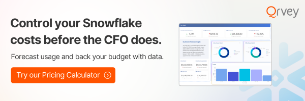
If warehouse costs are climbing faster than customer growth, our Snowflake Savings Calculator is worth reviewing.
Non-Technical Users Get Answers Without Filing Tickets
Drag-and-drop self-service analytics lets non-technical users build custom dashboards without SQL. Customers build dashboards, apply filters, and explore live data on their own inside your application.

This means fewer “Can your team build this report for us?” requests landing in engineering queues.
For SaaS companies, this also creates a clean monetization opportunity because advanced reporting tiers become a scalable revenue feature instead of an operational cost center.
Examples of Embedded Data Visualization Tools and Software
The best embedded data visualization tools balance flexibility, scalability, security, and user experience differently depending on the SaaS company’s architecture and goals.
- Qrvey
Qrvey was built specifically for multi-tenant SaaS applications, which immediately changes how the platform handles security, deployment, and scalability.

Instead of adapting enterprise bi tools that are single-tenant by design (and not meant to be used as customer-facing, multi-tenant solutions), Qrvey designed its architecture around embedded SaaS use cases from day one.
Key features
- Full JavaScript Embeds: Your frontend developers get complete UX control, injecting dashboard builders and charts directly into web components without relying on rigid iframes.

- Built-in Multi-Tenant Data Engine: The Ultra tier includes a native data transformation layer that shapes raw, semi-structured data like JSON or APIs into high-performance visual layers without needing extra ETL tools
- AI-Generated Visualizations: Users can create charts and dashboards using a natural language interface to auto-generate visualizations instantly.
- No-Code Workflow Automation: A drag-and-drop workflow canvas allows users to connect data triggers to real-time actions, like sending Slack alerts or triggering webhooks in third-party software

Best For
Qrvey is best for B2B SaaS companies & product teams that need a fully white-labeled, self-service visualization experience deployed directly within their own AWS or Azure cloud infrastructure.
Pricing
Qrvey uses a predictable flat-rate pricing model with no per-user or per-seat fees.
The structure offers two tiers: Qrvey Pro for teams with an existing analytics-ready database, and Qrvey Ultra for teams needing a full-stack data engine and transformation layer. Both tiers offer unlimited users, tenants, and dashboards under a single annual rate.
2. Reveal BI
Reveal BI built by Infragistics, is a developer-first embedded analytics SDK.

Instead of iframes, it renders visualizations directly inside your application’s component tree, which gives product teams tighter UI control and a more native feel.
Key Features
- Native SDK architecture (not iframe-reliant)
- Self-service drag-and-drop dashboard creator
- Generative AI conversational analytics
- Deep white-labeling
Pricing: Fixed packages based on deployment needs
Best for: ISVs and SaaS companies that want developer-controlled embedding

3. Yellowfin BI
Yellowfin is a full-stack analytics suite that combines embedded dashboards with automated anomaly detection (“Signals”) and AI-driven natural language query.

It’s designed for ISVs and OEMs that want white-labeled analytics without high internal engineering overhead.
Key Features
- Collaborative, action-based dashboards
- “Assisted Insights”: AI explains underlying data trends in plain language
- Revenue-sharing and per-unit pricing models for vendor go-to-market strategies
Pricing: Custom.
Best for: Teams needing scheduled reporting and narrative explanations
4. Zoho Analytics
Zoho Analytics is a self-service analytics platform with broad appeal for smaller to mid-market teams, particularly those already in the Zoho ecosystem.

Its “Ask Zia” AI assistant lets non-technical users query data in plain language, and its 500+ pre-built connectors make setup fast.
Key Features
- “Ask Zia” natural language AI assistant
- Automated data preparation and SQL query engine
- Pre-built dashboards for popular business apps
Best for: Smaller SaaS teams or departmental users that need affordable, fast-to-deploy analytics without complex multi-tenant architecture.
5. Domo
Domo is a cloud-native platform that combines data integration (its “Magic ETL” tool), storage, and visualization in a single interface. It’s fast to deploy for non-technical teams and has 1,000+ pre-built data connectors.

Key Features
- Magic ETL for no-code data transformation
- 1,000+ pre-built connectors
- Broad BI capabilities for sales, marketing, and ops teams
Pricing: Consumption-based
Best for: Mid-to-large enterprises without a dedicated data engineering team that want fast, centralized dashboards.

Differences Between Embedded Data Visualization Tools and Traditional Analytics
Traditional analytics systems were engineered for internal teams to view historical metrics across a single company infrastructure. Embedded tools are built to handle the unique security, scale, and performance needs of multi-tenant commercial software.
| Dimension | Traditional Analytics | Embedded Data Visualization Tools |
|---|---|---|
| Primary user | Internal teams | External customers (tenants) |
| Multi-tenancy | Custom RLS workarounds | Native, architecture-level isolation |
| UI control | Tool branding bleeds through | Full white-labeling |
| Licensing | Per-user, spikes at scale | Flat-rate or per-deployment |
| Deployment | Vendor-hosted | Your cloud (AWS, Azure) |
| Security | Separate user management | Inherits your app’s auth via tokens |
How to Choose the Right Embedded Data Visualization Solution?
Save time: Qrvey’s Embedded Analytics Evaluation Guide and Questions to Ask an Embedded Analytics Vendor checklist cut through the vendor selection noise.
Your engineering and product teams should evaluate prospective vendors against five core technical categories to ensure long-term product alignment.

1. Developer Customization and Integration Flexibility
Your software team must have full programmatic control over the dashboard experience.
Look for platforms that expose comprehensive JavaScript APIs and web component wrappers so your developers can alter themes, toggle global filters, and deploy code updates through your existing CI/CD pipelines.
2. Multi-Tenant Data Isolation and Core Security
Security is your absolute priority. Select a platform that ensures one customer can never catch a glimpse of another tenant’s data.
It should support a robust semantic layer that maps database queries dynamically based on the active user’s permissions.
3. Scalable, Predictable Software Pricing
Avoid pricing structures that penalize your business growth with per-seat or per-user fees. If your customer base scales from 100 users to 10,000 users, your software margins will collapse under a user-based license model. Prioritize vendor options that offer unlimited scale under a single flat rate.
4. Advanced Self-Service and AI Capabilities
Enterprise clients no longer want static charts; they expect to build their own custom views. Your chosen tool must provide an intuitive, drag-and-drop dashboard builder along with conversational AI insights that allow non-technical users to query datasets using natural language.
See self-service data visualizations built with AI in this clickable demo.
5. Deployment Control and Infrastructure Architecture
Your security compliance guidelines likely restrict where your customer data can travel. Choose an analytics vendor that deploys containerized applications directly within your own AWS or Azure cloud environment via Kubernetes, so data never leaves your secure perimeter.
Best Practices for Effective Embedded Data Visualization
Building an intuitive data experience requires following clear user interface and data engineering principles including:
- Mapping the two or three decisions each tenant persona makes daily and building visualizations around those. Adoption follows usefulness, not feature count
- Designing drill-down paths that follow how customers think, not how your schema is organized. A fundraising user thinks “event → donor → amount,” not “foreign key join”
- Keeping dashboards close to workflows. Users should see data exactly where decisions happen, not buried three menus deep
- Using role-based interfaces: Executives, support agents, and operational users rarely need the same dashboard complexity
- Designing for self-service carefully: Flexibility matters but unrestricted dashboard creation creates inconsistent metrics across tenants
What Could Go Wrong? Challenges to Watch Out For
Failing to plan for long-term scalability can introduce major engineering bottlenecks down the line.
- Trying to build a custom visualization engine in-house using basic chart libraries often consumes years of development time, pulling your engineering team away from core product innovation.
- Warehouse cost explosions: High-frequency dashboard querying can dramatically increase cloud data costs without careful optimization
- Analytics that feel disconnected: If dashboards look visually separate from the application, users treat them as secondary tools instead of core workflows

Use Cases
These examples below show how diverse software applications apply embedded data visualization frameworks to solve complex customer demands.
Operational Healthcare Platforms
Healthcare organizations often need pixel-perfect reports, tenant-specific permissions, and operational dashboards simultaneously. Embedded visualization allows clinic managers, billing teams & operational leaders to work from the same live datasets without exposing unrelated data.
Qrvey’s reporting tools support these scenarios with precise formatting controls and role-based dashboard experiences.

Democratizing Data Without Growing the Engineering Team
EvenFlow AI builds scheduling optimization for automotive dealerships. Yet critical performance insights were locked away from non-technical business users, forcing manual analysis in Excel.
Embedding Qrvey into their AWS stack put dashboards in front of customers without adding headcount. And an automated “Daily Recall Report” contributed to up to a 30% reduction in operational inefficiency.

That’s the difference between passive reporting and operational analytics embedded directly into day-to-day work.
Start Visualizing Data Directly in Your Product with Qrvey
Delivering high-quality visual insights to your software users does not have to mean overloading your engineering roadmap for the next twelve months.
Choosing an analytics platform like Qrvey, engineered for multi-tenant SaaS environments, means you deploy beautiful dashboards, self-service builders, and automated no-code workflows directly inside your product.Take the next step and Book a Demo with our engineering team today.
FAQs
What is embedded data visualization?
Embedded data visualization places interactive charts, graphs, and dashboards directly inside an application so users explore data in context, with filtering and drill-downs, instead of exporting to a separate BI tool.
How do you embed interactive charts without iframes limiting them?
Use a platform that provides native components and APIs so visuals integrate directly into your app, inheriting your styling and interacting with the page. Native embedding avoids the styling and interaction ceilings that iframes impose.
How do you blend live and historical data in one set of visuals?
Source some visuals from a live connection to your transactional database for current data and others from a cached lake or warehouse for history, then combine them on one dashboard. Treating a dashboard as a mashup of datasets makes this possible.
How do you let users personalize and save their own chart views?
Give users the ability to adjust charts, filters, and layouts and save them as personal views that persist across sessions, on top of governed data. Personalization drives engagement while permissions keep data access in bounds.
What should you look for when choosing visuals to embed?
Prioritize chart breadth, real interactivity like drill-downs and custom formulas, deep white-label styling, native embedding without iframes, granular permissions, and strong performance on large datasets across many tenants.
How do you keep embedded visuals fast on large datasets?
Use an efficient data layer that pre-processes and caches data, push filtering and aggregation down to the source, and connect in place to existing warehouses where useful so you avoid moving data unnecessarily.
Natan brings over 20 years of experience helping product teams deliver high-performing embedded analytics experiences to their customers. Prior to Qrvey, he led the Client Technical Services and Support organizations at Logi Analytics, where he guided companies through complex analytics integrations. Today, Natan partners closely with Qrvey customers to evolve their analytics roadmaps, identifying enhancements that unlock new value and drive revenue growth.