


⚡Key Takeaways
- A data visualization dashboard transforms raw data into visual insights that help you make faster decisions without digging through spreadsheets or reports
- More than 83% of organizations now rely on dashboards for data visualization to track everything from sales performance to customer success metrics
- Building dashboard data visualization from scratch takes months and constant maintenance, while buying a pre-built solution can get you live in weeks with full white-label control
You can have all the data in the world and still make slow or misguided decisions. The fix is a data visualization dashboard that organizes spreadsheets and scattered reports into clear, actionable visuals.
Dashboards have earned their place as decision-making accelerators, helping companies optimize processes and react to issues in real time using visual insights. From operational insights to personalized dashboards, keep reading as we show you what makes dashboards so powerful, the mistakes to avoid, and how to build one that gives you instant clarity.
What Is a Data Visualization Dashboard?
Dashboards and data visualization pull information from multiple data sources like databases, Google Analytics, or customer relationship management systems and display it as charts, graphs, and numbers you can scan in seconds.
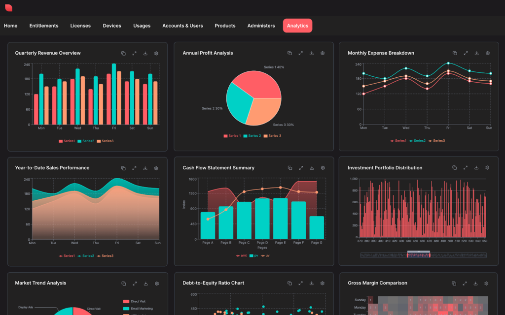
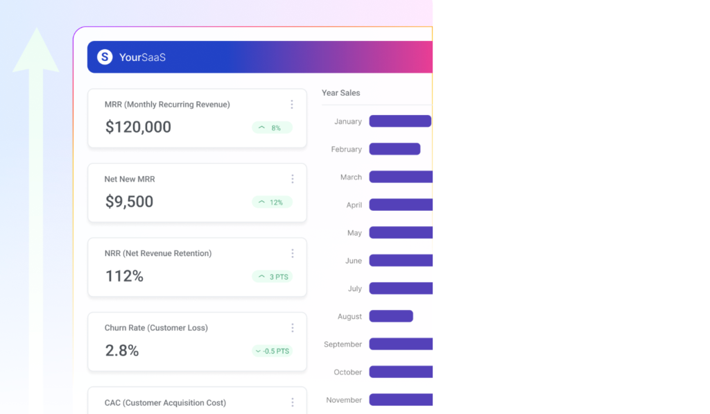
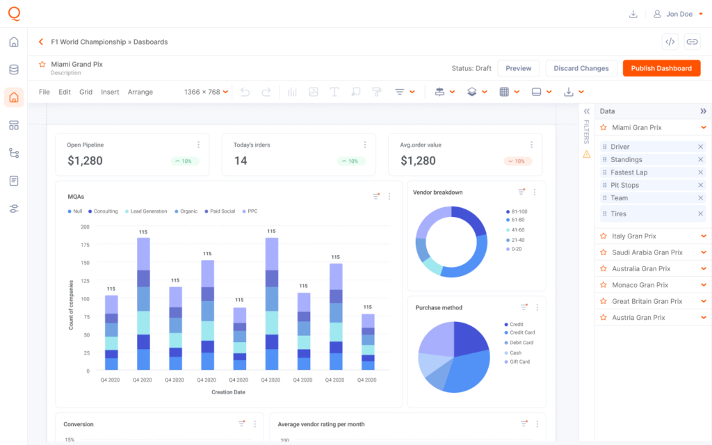
Data visualization examples in a dashboard from Qrvey.
According to Market Growth Reports, the global data visualization market will reach $25.77 billion by 2034, growing from $10.63 billion in 2025. That’s because visual data answers questions faster than tables ever could.
As computer scientist Ben Shneiderman puts it: “Visualization gives you answers to questions you didn’t know you had.”
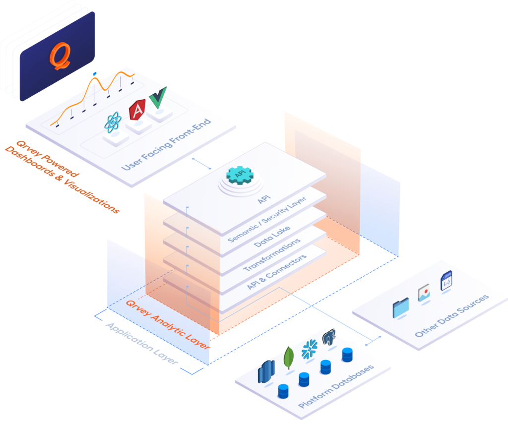
When you embed a dashboard into your application, users get real-time data updates without leaving your product. Embedded analytics means your customers never see a third-party logo or clunky iframe.
With Qrvey’s white-label approach, it feels like a native part of your product.

Key Benefits of Data Visualization Dashboards
Data visualization dashboards deliver five concrete advantages that change how your business operates.
Faster Decision-Making
47% of tools now incorporate AI-based features, making it even faster to surface insights without manual digging. Real-time data updates mean you don’t wait until next week’s meeting to discover your sales pipeline dried up or your email marketing campaign flopped.
Your sales reps can check their numbers between calls and marketing managers can adjust Facebook Ads campaigns during lunch. Embedded analytics features like drill-downs and filters let users explore data themselves rather than waiting for someone else to generate a report.
Better Pattern Recognition
Edward Tufte, professor emeritus at Yale University, famously said: “There is no such thing as information overload. There is only bad design.“
Your brain processes visual elements 60,000 times faster than text which is why patterns jump out instantly.
A spike in your social media dashboard catches your eye immediately; a slow decline in key performance indicators becomes impossible to ignore when shown over time. This is why creating stunning data visualizations matters so much. More than making things pretty, you make insights unavoidable.
Democratized Data Access
Remember when only your data team could answer questions about performance metrics? Self-service analytics changes that completely. Users build their own dashboards, filter their own views, and answer their own questions without submitting tickets.
A property management company using your SaaS platform can create custom reports for their 50 buildings without calling your support team.
No-code data analytics tools make this possible for non-technical users who wouldn’t know SQL from a sandwich.
Reduced Reporting Overhead
When customers have self-service dashboards for data visualization, they stop asking you to export data every time they need to check their numbers. Analytics as a service means you’re not maintaining complex reporting infrastructure or hiring specialized data engineers.
Improved Stakeholder Alignment
When everyone sees the same numbers, alignment stops being a meeting topic. Sales, marketing, and product teams all work from one data visualization dashboard, so debates over “whose spreadsheet is right” disappear.
Marketing metrics and sales performance update together, from the same source, in real time.
Advanced Multi-Tenant Security
The value of a dashboard is lost if data privacy is compromised. One of the core technical benefits of an embedded solution is the seamless integration of access controls.
By using token-based JavaScript embeds, platforms like Qrvey enforces strict row- and column-level security across the entire platform.
This allows you to serve multiple customers from a single master dashboard, with the system automatically filtering the view so users only see the data they are authorized to access.
Get a preview of how Qrvey approaches Record Level Security (RLS) in this clickable demo.
Types of Dashboards and How They’re Used
Every dashboard is built with a moment in mind. Some support high-level planning, while others guide quick, operational decisions. Understanding these differences is key to choosing (or building) the right dashboard.
Embedded Customer-Facing Dashboards
This is where SaaS products either earn loyalty or drive churn. Instead of forcing users to export data or switch tools, you embed analytics directly into your application, so insights live where work happens.
When Global K9 Protection Group outgrew QuickBase, they migrated to AWS and embedded Qrvey analytics into their platform. The result was 60% lower costs and real-time dashboards supporting more than 120 client locations.

For customers, this meant faster decisions without friction. For the business, analytics shifted from a cost center to a retention and differentiation engine.
Operational Dashboards
Operational dashboards answer one simple question: What’s breaking right now?
Support teams use them to track response times, logistics teams use them to spot stalled shipments before customers complain. That’s why these dashboards depend on real-time data, not daily reports.
Pro Tip: Qrvey makes it easy to show real-time activity alongside past performance—without adding extra systems or complexity.
Strategic Dashboards
Executives need a clear snapshot of how the business is performing over time. Strategic dashboards focus on monthly or quarterly key performance indicators like total projects, project size averages, and income group distribution.
These high-level metrics help leaders spot trends, measure progress, and make long-term decisions with confidence. With data analytics modernization, teams replace static slide decks with dashboards that update automatically and stay relevant.
Pro Tip: Strategic dashboards should answer one question fast: Are we winning or falling behind?
Self-Service Analytical Dashboards
Power users often need more than pre-built charts; flexibility makes them stick around.
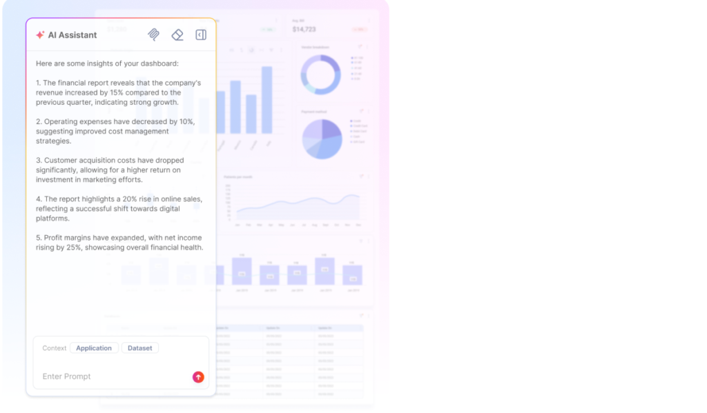
Tools like Qrvey’s AI Chart Builder makes this easy. Users can simply type requests in natural language, like “show me conversion rates by marketing channels for Q4”, and the system automatically generates the chart.
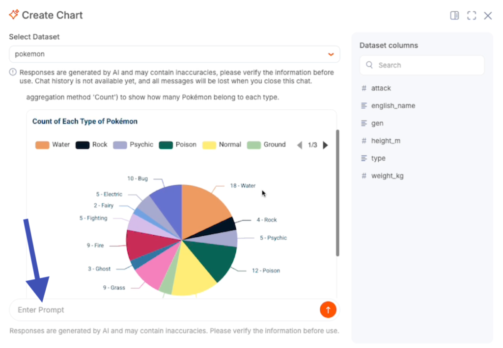
You can connect it to your preferred LLM provider (ChatGPT, Gemini, Cohere, or Claude) so your dashboards stay interactive, intuitive, and fully customized for each user.
How To Build a Data Visualization Dashboard (Step-by-Step)
When you skip straight to picking colors before defining what metrics matter, you build something pretty that nobody uses. Here’s the process that leads to data visualization dashboard examples customers open every day.
Step 1: Define Your Users and Their Questions
Start by listing who will use this dashboard.
- Are they your internal team checking project status?
- Your customers tracking their customer success metrics?
Then write down the three questions they ask most often. A marketing manager might ask: “Which marketing channels drove the most conversions last month?”
Mathematician John Tukey wrote:
“The greatest value of a picture is when it forces us to notice what we never expected to see.“
Your dashboard should answer the obvious questions while surfacing unexpected patterns.
Step 2: Identify Your Data Sources and Metrics
Start by cataloging every system where your data exists: Google Analytics, CRMs, ecommerce platforms, analytics databases, or data warehouses.
Then, decide which metrics answer your questions. For example, “Are sales targets being met?” calls for regional, rep-level, and time-based sales performance. Traditional data warehouses often require heavy transformations to combine these sources.
Embedded analytics solutions such as Qrvey simplify this by using a multi-tenant data lake with pre-built connectors for Google BigQuery, Facebook Ads, and many more, so you can focus on building dashboards rather than wrangling data.
Step 3: Design the Layout and Visual Hierarchy
Place your most critical metrics where users notice them first, usually the top left.
- Highlight key performance indicators with large numbers and position supporting charts below
- Filters and controls work best along the top or side for easy access
- Keep colors consistent; if blue represents revenue in one chart, it should do so across the dashboard
Qrvey’s dashboard templates give users a head start, letting your team set brand-aligned defaults while still enabling customization.
Pro Tip: Following visualization best practices ensures that everyone interprets data clearly and consistently.
Qrvey offers dashboard templates as starting points so your users don’t face a blank canvas. Product teams can create templates that match your brand, then let users customize from there. Best practices for creating effective data visualizations ensure everyone interprets the data the same way.
Step 4: Connect Your Data and Build Visualizations
If you’re embedding in a SaaS app, you use APIs to connect your data sources to your analytics platform. Qrvey handles the messy parts automatically. You don’t write custom ETL for every data source or build separate security models for multi-tenant data.
Step 5: Test, Iterate, and Enable Self-Service
Start by launching your dashboard to a small group and observe how they interact with it compared to your expectations.
If users consistently filter by date, make that the default. If they drill into regional metrics often, reduce the clicks needed. Once optimized, give them self-service access.
With Qrvey’s Smart Analyzer, users can ask questions in natural language and get instant answers, letting every user explore the data without you creating every possible report.
Want to see how fast implementation can be? Check out interactive demos to see a real example from your industry
Data Visualization Dashboard Examples
Seeing dashboards in action makes all the difference. Explore how these companies solved real-world problems with powerful embedded data visualization.
JobNimbus CRM Dashboards for Contractors
JobNimbus faced a common SaaS problem: enterprise customers were churning because reporting was too rigid. Contractors needed real-time visibility into project status across dozens of job sites.
After integrating Qrvey’s embedded analytics, JobNimbus delivered self-service dashboards that let non-technical users build their own views. The results: 70% user adoption, reduced churn, and improved satisfaction scores.

Multi-Tenant SaaS Analytics Dashboard
Say you run a platform with 500 customers and each customer manages different properties with different key performance indicators they care about. Building separate dashboards for each would be impossible.
Impexium, an Association Management Solutions provider, needed exactly this. By partnering with Qrvey, they unified data collection, automation, and analytics into one platform.
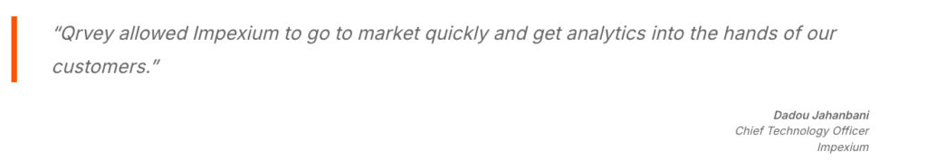
Customers could perform their own analyses and deploy advanced capabilities faster than ever.
Real-Time Field Services Dashboard
Global K9 Protection Group protects airports and critical infrastructure with trained detection dogs. Their clients at 120+ locations need instant visibility into service delivery and performance trends.
After migrating to AWS and integrating Qrvey, they built dashboards that unified multiple data sources. Clients got real-time data updates and Global K9 cut costs by 60%. The data visualization dashboard became a competitive advantage while improving satisfaction.
Building vs Buying Data Visualization Dashboard Tools
You need embedded dashboards that deliver insights fast, but your team is already stretched. Do you spend weeks building internal analytics or partner with a platform that handles multi-tenant reporting, security, and real-time data for you?
Buy an Embedded Analytics Solution
Buying an embedded analytics solution makes sense when your team should focus on your core product, not becoming data engineering experts.
With Qrvey, you get a multi-tenant data lake, dashboard templates, white-labeled components, and APIs connecting any data warehouse, all deployable in weeks. Developers use simple JavaScript embeds, while customers enjoy native-feeling analytics with inherited security. AI features like the Chart Builder and Smart Analyzer also let users interact naturally with data.
Not sure if buying makes financial sense? Use our free ROI calculator to compare build versus buy costs for your specific situation
Build Your Dashboards In-House
Building dashboards in-house works if you have senior data science and engineering talent, unique analytics needs, and patience for 12–18 month timelines.
But true complexity (multi-tenant security, real-time syncing, self-service dashboards, and fast querying) often stalls projects. That’s why software product managers love Qrvey: analytics features delivered in weeks!
Final Note on Qrvey
End the cycle of endless analytics development with Qrvey. Our embedded analytics platform integrates customer-facing dashboards directly into your SaaS product, giving you full control over design, interface, and data management.
Users can explore self-service insights, build custom reports, and export data seamlessly, while your engineers focus on core features.
Book a demo with Qrvey to start delivering dashboards your customers love.

David is the Chief Technology Officer at Qrvey, the leading provider of embedded analytics software for B2B SaaS companies. With extensive experience in software development and a passion for innovation, David plays a pivotal role in helping companies successfully transition from traditional reporting features to highly customizable analytics experiences that delight SaaS end-users.
Drawing from his deep technical expertise and industry insights, David leads Qrvey’s engineering team in developing cutting-edge analytics solutions that empower product teams to seamlessly integrate robust data visualizations and interactive dashboards into their applications. His commitment to staying ahead of the curve ensures that Qrvey’s platform continuously evolves to meet the ever-changing needs of the SaaS industry.
David shares his wealth of knowledge and best practices on topics related to embedded analytics, data visualization, and the technical considerations involved in building data-driven SaaS products.
Popular Posts

Why is Multi-Tenant Analytics So Hard?
BLOG
Creating performant, secure, and scalable multi-tenant analytics requires overcoming steep engineering challenges that stretch the limits of...

How We Define Embedded Analytics
BLOG
Embedded analytics comes in many forms, but at Qrvey we focus exclusively on embedded analytics for SaaS applications. Discover the differences here...

White Labeling Your Analytics for Success
BLOG
When using third party analytics software you want it to blend in seamlessly to your application. Learn more on how and why this is important for user experience.