


⚡Key Takeaways
- Interactive data visualizations let users filter, drill down, hover, and explore data on their own terms, unlike static charts that lock users into a single fixed view
- The biggest mistake teams make is picking a chart type before defining the decision it needs to support
- Interactivity directly reduces load on the support team, increases session time, and improves product stickiness
- For multi-tenant SaaS products, the ability to provide interactive analytics that perform at scale depends on choosing the right architecture and a platform that supports it
Your users don’t want prettier charts. They want to stop emailing your support team every time they need a different data cut.
Interactive data visualizations solve that problem. They let users filter, drill down, and explore on their own terms without filing a ticket or waiting on a report.
This guide walks through what makes a visualization interactive, how to build one that actually gets used, and what good looks like in practice across different SaaS use cases.
What Are Interactive Data Visualizations?
An interactive data visualization is any visual representation of data that responds to user input.
That could mean hovering over a bar to see a breakdown, clicking a filter to isolate one customer segment, or drilling into a line chart to see daily numbers behind a monthly trend. The keyword is responds; the user does something, and the visualization changes.
This is different from a PDF export or a static chart embedded in a slide deck. Those tell one story, once. An interactive visualization lets users ask follow-up questions without needing a data analyst to answer them.
For SaaS products specifically, this distinction matters a lot. If your customers are logging into your platform and immediately exporting to Google Sheets or Excel, that’s a product problem. Interactive visual content is what keeps them inside your app.
As Ben Shneiderman, Professor of Computer Science, famously said, “Visualization gives you answers to questions you didn’t know you had.”

Static vs. Interactive Data Visualizations: What Changes for the User
Static charts are good enough for a slide deck. They’re not good enough for a SaaS product where customers expect to explore their own data. The difference is functional.
Here’s what changes for the user when you move from static to interactive:
| Aspect | Static data visualizations | Interactive data visualizations |
|---|---|---|
| User control | Creator decides what the user sees | Users can filter, sort, zoom, and explore |
| Depth of insight | One fixed view of the data | Multiple views accessible through drill-down capabilities |
| Update frequency | Manually recreated when data changes | Can pull live or near-live data automatically |
| Engagement | Passive, user reads it | Active, user interacts with it |
| Best fit | Printed reports, slide decks, printed publications | Embedded dashboards, web apps, and self-service portals |
Interactive data visualization is significantly more effective than static charts at motivating deeper, more accurate processing of complex information. Users don’t just see the data, they reason through it.
And as Hans Rosling put it: “Most of us need to listen to the music to understand how beautiful it is. But often that’s how we present statistics: we just show the notes, we don’t play the music.”
Static charts show notes. Interactive ones play music.
What Are The Benefits Of Interactive Data Visualizations (By Use Case)
For the right use cases, interactivity is the difference between analytics that drive decisions and one that gets exported to Excel.
Users Self-Serve Instead of Filing Tickets
When users can filter by date range, segment, or region on their own, they stop emailing your support team for custom reports.
That’s a direct reduction in support load and a signal that your product is genuinely useful.
A static dashboard can’t do this as there’s nothing to click. The interactivity itself is what reduces your support burden while increasing the value to your customers.
Customer-facing analytics built around exploration keep users inside your product longer.
See how to build an interactive chart in Qrvey in this clickable demo.
Interactivity Surfaces Patterns Static Views Hide
A smoothed line chart showing monthly revenue looks fine until a user drills down to the weekly view and spots a recurring dip every third week. That’s a pattern a static snapshot would never show.
Interactive data visualization rewards curiosity, and MIT research confirms this: well-designed interactive encodings replace complex cognitive calculations with simpler perceptual inferences, making it faster and easier to spot what actually matters.
Non-Technical Users Stay in the Product Longer
A well-built interactive visualization teaches users how to read their own data.
When tooltips explain metrics on hover and filters make options visible at a glance, users learn the product by using it. That’s interactivity doing the teaching instead of it coming from a training doc or a support call.
New users figure out the product faster, and that directly improves CSAT and time-to-value. You also have less churn from users who ‘never figured it out.’
Every Tenant Sees Their Data, Not Everyone Else’s
In a multi-tenant SaaS product, one dashboard doesn’t fit all. Interactive visualizations with tenant-level filtering mean a customer using your platform sees their data as defined by their organization and role.
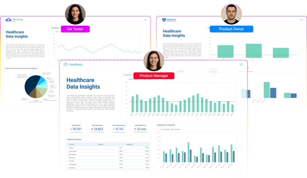
That’s the personalized dashboard experience that drives adoption.
Users Control the Depth, Not Just the View
Static visualizations lock users into whatever summary the builder chose.
Interactive ones let users set the scope, expanding time ranges, toggling metrics, and switching between aggregate and transaction-level data. That control is what turns an analytics feature into a product that users actually value.
When someone can answer their own question without asking your team, they’re more likely to renew.
How To Create Stunning Interactive Data Visualizations (Step by Step)
The steps below apply whether you’re building visualizations in-house or embedding a third-party analytics layer into your SaaS product.
1. Define the Goal and the Audience
Before you open a single tool, answer two questions:
- What decision should this visualization help someone make?
- Who is making that decision?
A data visualization built for an operations team looks very different from one built for a nonprofit fundraiser or a construction project manager. Your audience determines which metrics belong on screen, how much complexity they can handle, and whether they’ll need drill-down capabilities or just a clean summary view.
- Write down the one thing a user should understand after looking at this visualization
- Identify whether the user is technical or not, as this drives your filter design
- Confirm what decision or action the visualization is meant to trigger
Skip this step, and you’ll end up designing for yourself, not your user.
2. Prepare and Structure Your Data
Messy data produces misleading visuals, no matter how good the design is. Before you build anything, your data needs to be clean, consistent, and structured for the question you’re answering.
This means:
- Removing duplicate records and null values that will break calculations
- Standardizing formats (dates, currency, naming conventions across tenants)
- Deciding on the data model that will power the visualization (whether that’s a live query against a data warehouse, a curated dataset, or a transformed layer)
For a practical look at how data preparation fits into a larger analytics workflow, Qrvey’s guide on collecting data for analytics is worth bookmarking.
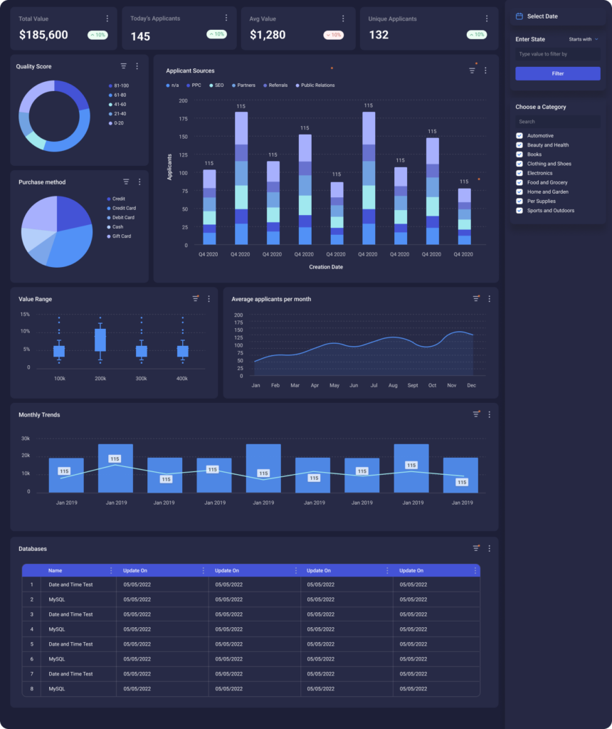
3. Choose the Right Chart Type for the Question
Using the wrong chart type for the question actively misleads the reader.
| Question type | Chart to use |
|---|---|
| How does X change over time? | Line chart or smoothed line chart |
| How do categories compare? | Bar chart or table chart |
| How is a total distributed? | Pie or donut chart (max five slices) |
| Is there a relationship between two variables? | Scatter plot |
| Where is something happening? | Map with geographical data |
One practical rule: if a user has to read the legend to understand what they’re looking at, the chart type is probably wrong for the audience.
4. Add the Interactive Elements
This is where a static chart becomes an interactive data visualization. The goal is to give users control without overwhelming them. Layer these in order of complexity:
- Tooltips: surface detail on hover without cluttering the chart
- Filters: let users slice by date, category, segment, or any relevant dimension
- Drill-downs: click from annual → quarterly → monthly → transaction level
- Dynamic views: toggle between chart types or update based on user input
For multi-tenant SaaS: Drill-down requires queries that filter data per tenant and a semantic layer that standardizes how data is labeled. Skip either one and drill-down may work in testing, but fail when multiple tenants hit it at once
5. Test It With Real Users, Then Iterate
You’re too close to your own visualization to judge it objectively. Show it to three to five people who match your intended user type and watch what they do, not what they say.
Useful things to observe:
- Which element do they click first?
- Do they find the filters without being told where they are?
- Do they reach a useful insight, or do they give up?
- Does anything load slowly enough to cause frustration?
Then refine. Take the first version of any interactive visualization as a hypothesis and the tested version as the product.
What Separates a Good Interactive Visualization From a Great One
Getting the steps right produces a working visualization. These practices produce one that actually gets used.
Make the Default View Immediately Useful
The first thing a user sees when a dashboard loads should answer a question, not ask one.
Don’t make users configure filters before the chart shows anything meaningful. Pre-load a sensible default: last 30 days, all regions, top-level summary. Let them drill from there.
Make Controls Obvious Without Labeling Everything
If a user can’t find the filter, the filter doesn’t exist. Controls should not be buried in a settings panel or a tooltip that appears on hover only. At the same time, don’t label every single element. Overexplaining adds clutter.
Interactivity Should Have a Purpose
Every interactive element should answer a question a user actually has. Adding animations, clickable elements, or toggles just because you can create noise.
Ask: What does this let the user understand that they couldn’t before? If the answer is unclear, cut it. Good data design is always subtractive.
Design for Accessibility From the Start
Roughly 8% of men have some form of color vision deficiency. That’s not an edge case. For an enterprise SaaS with thousands of end users, 8% is a significant portion of your customer base.
Color-only encoding excludes them. Always pair color with shape, pattern, or label.
Test on mobile; a filter panel designed for desktop may be unusable on a phone, and your enterprise customers’ end users are increasingly on both.
Performance Is Part of the Experience
A beautiful visualization that takes eight seconds to load is a bad visualization. If your queries are hitting a data warehouse cold every time a filter changes, users will notice. Techniques like semantic modeling and pre-aggregated datasets can dramatically reduce query time.

Examples of Interactive Data Visualizations Done Well By Use Case
What “good” looks like changes by scenario, so let’s look at interactive data visualization examples, organized by use case, so you can match patterns to your own product
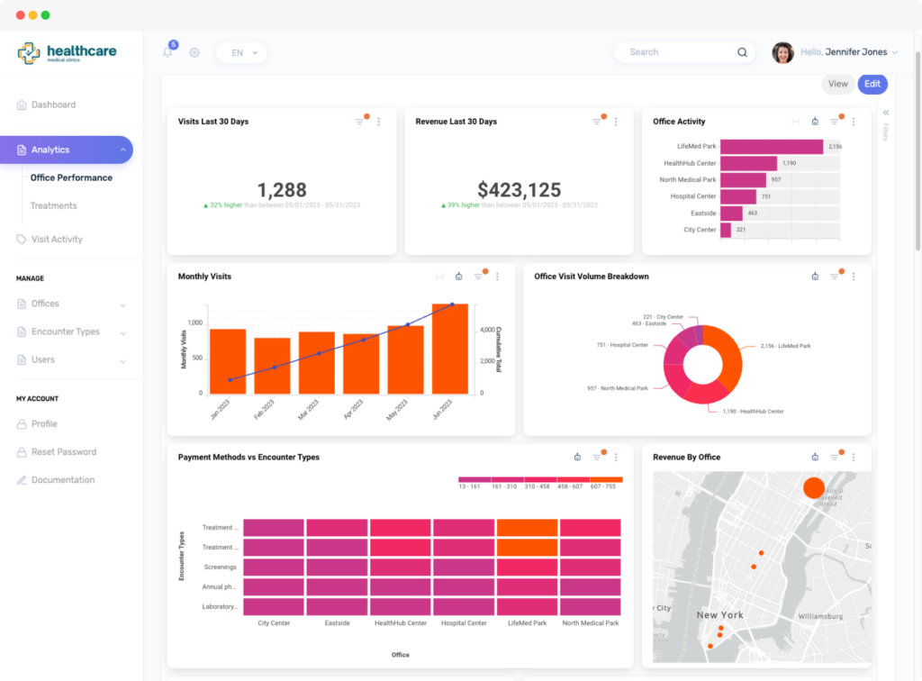
Customer-Facing Embedded Analytics for SaaS
JobNimbus builds CRM software for roofing contractors. Their enterprise customers were churning because the reporting module was too rigid & complex projects couldn’t be sliced the way users needed.
JobNimbus embedded Qrvey’s self-service, drag-and-drop dashboard builder, giving non-technical contractors the ability to build their own custom reports. Within months, they saw 70% adoption among large enterprise users and a meaningful increase in product-market fit.

The visualization wasn’t the feature here. Control was.
Internal BI Visualization
EvenFlow AI’s dealership customers were data-starved. Key performance insights were locked in a backend “black box,” forcing manual exports and one-off reports that only got produced when someone had bandwidth.
Embedding Qrvey inside their AWS stack changed both sides of that equation.
Dealerships got real-time dashboards and automated workflow reports, including a “Daily Recall Report” that alerts parts managers before appointments. Internally, non-technical staff could finally investigate support issues independently, without pulling a developer into every ticket.
The result was up to 30% reduction in operational inefficiencies. Visualization living inside the workflow mattered here more than the chart type, users didn’t have to leave the application to get an answer.
Self-Service Association Analytics
Impexium manages analytics for over 2,000 association implementations. Previously, every chart or report required a manual request to their team.
By embedding interactive visualization with built-in sentiment analysis from member surveys, association staff could explore member engagement data themselves (filtering by event, membership tier, or region) without filing a ticket.

This is a strong example of user participation changing the relationship between a SaaS product and its end users. When the data is explorable, users stop being passive consumers of reports and become active analysts of their business.
How To Measure The Impact Of Your Data Visualizations
Shipping is not the finish line. Track these signals to know whether your visualizations are actually working.
These five signals will tell you whether your interactive visualizations are doing their job or just taking up screen space:
- Filter usage rate: are users applying filters, or viewing the default state only?
- Drill-down depth: are users clicking into detail views, or stopping at the summary?
- Session time on analytics pages: a sharp drop suggests the visualization isn’t answering the question
- Support tickets related to reporting: a reduction here is a direct signal that self-service is working
- Export rate: if users are still exporting to Excel, the visualization isn’t answering their question
These metrics tell you whether users are engaging and where the interactive experience is falling short.
Bring Embedded Data Visualization Into Your SaaS With Qrvey
Qrvey connects directly to modern data warehouses using Live Connect, allowing your application to query warehouse data in real time without duplicating it. Alternatively, for SaaS companies that have not already invested in a data warehouse, Qrvey provides an optimized data engine and no-code data pipelines to ingest data from a variety of data sources into an analytics-ready repository.
Every visualization component is embeddable via JavaScript, fully white-labeled, and built for multi-tenant environments where data isolation isn’t optional.
If your engineering team is still maintaining a custom reporting layer (patching security models per tenant, managing ETL pipelines, and losing sprints to analytics tickets), that’s the problem Qrvey was built to solve.
See how Qrvey’s embedded analytics platform works or book a demo to see it inside a real SaaS product.
FAQs
How do I control what different users or roles can see inside the same dashboard?
Through role-based permission controls. You can lock down specific dashboards, individual charts, or UI elements based on who’s logged in. For SaaS products, you can scope this to the tenant level too, so one customer never sees another’s data or controls.
What is a data warehouse?
A data warehouse is a centralized system that stores large volumes of structured data from multiple sources, optimized for querying and analysis rather than day-to-day transactions.
How does Qrvey work with my data warehouse?
Qrvey’s Live Connect feature queries your data warehouse (including Snowflake) in real time, so your visualizations always reflect current data without requiring a separate data copy or ETL pipeline. This means fewer queries hitting Snowflake cold, which directly reduces your Snowflake costs.
What if I don’t have a data warehouse?
In addition to the Live Connect feature, Qrvey offers an optimized data engine and no-code data pipelines to connect to one or more of your transactional data and other data sources. This is a unique capability of the Qrvey platform that provides SaaS companies the option to leverage one or both methods (Live Connect or ingested data into the Qrvey Data Engine) for reporting and analytics at scale and with minimal compute costs.
How long does it take to embed interactive analytics into a SaaS product?
With a purpose-built embedded platform like Qrvey, SaaS teams typically get analytics in front of customers in weeks. Building in-house typically takes six to 18 months.

David is the Chief Technology Officer at Qrvey, the leading provider of embedded analytics software for B2B SaaS companies. With extensive experience in software development and a passion for innovation, David plays a pivotal role in helping companies successfully transition from traditional reporting features to highly customizable analytics experiences that delight SaaS end-users.
Drawing from his deep technical expertise and industry insights, David leads Qrvey’s engineering team in developing cutting-edge analytics solutions that empower product teams to seamlessly integrate robust data visualizations and interactive dashboards into their applications. His commitment to staying ahead of the curve ensures that Qrvey’s platform continuously evolves to meet the ever-changing needs of the SaaS industry.
David shares his wealth of knowledge and best practices on topics related to embedded analytics, data visualization, and the technical considerations involved in building data-driven SaaS products.
Popular Posts

Why is Multi-Tenant Analytics So Hard?
BLOG
Creating performant, secure, and scalable multi-tenant analytics requires overcoming steep engineering challenges that stretch the limits of...

How We Define Embedded Analytics
BLOG
Embedded analytics comes in many forms, but at Qrvey we focus exclusively on embedded analytics for SaaS applications. Discover the differences here...

White Labeling Your Analytics for Success
BLOG
When using third party analytics software you want it to blend in seamlessly to your application. Learn more on how and why this is important for user experience.