


⚡Key Takeaways
- Best embedded analytics: Qrvey is the top choice for SaaS businesses needing scalable, multi-tenant embedded analytics with AI-driven insights.
- Best interactive visualizations: Tableau excels in creating detailed, interactive dashboards with an intuitive drag-and-drop interface.
- Best AI-powered search analytics: ThoughtSpot leverages AI for natural language-based querying and automated insights.
- Best open-source flexibility: Metabase provides an affordable, open-source alternative with self-hosted and cloud deployment options.
According to third-party user reviews, Sisense often starts as a promising BI solution for many businesses, but over time reveals several recurring pain points:
- Lengthy implementation cycles
- Ongoing engineering effort
- Unpredictable pricing
Sound familiar? You’re not alone.
The good news: There are better options.This guide breaks down 11 Sisense competitors, highlighting their strengths, pricing, and best use cases, so you can skip the trial-and-error phase and find a BI tool that fits your needs, not the other way around.

Comparison Table: Sisense Alternatives
| Name | Best for | Standout feature | Starting price |
|---|---|---|---|
| Qrvey | Self-service embedded analytics & automation | No-code workflow automation | Custom pricing |
| Tableau | Interactive data visualization | Drag-and-drop dashboard builder | $15/user/month |
| Power BI | Affordable self-service BI | Microsoft ecosystem integration | Free and $14/user/month |
| Looker | Data modeling & embedded analytics | LookML for advanced modeling | Custom pricing |
| Domo | Mobile-first BI | Intuitive mobile dashboards | Custom pricing |
| Mode | SQL-based analytics | Integrated Python & R support | Free and paid (on request) |
| GoodData | White-labeled analytics | Customizable UI & API access | Contact for pricing |
| Metabase | Open-source BI | Self-hosted & cloud options | Free and $100/month + $6/user/month |
| Yellowfin | Automated insights & storytelling | AI-powered data narratives | Custom pricing |
| Holistics | Headless BI & data modeling | Code-free data pipeline | $960/month |
| ThoughtSpot | AI-powered search analytics | Natural language querying | $25/user/month |
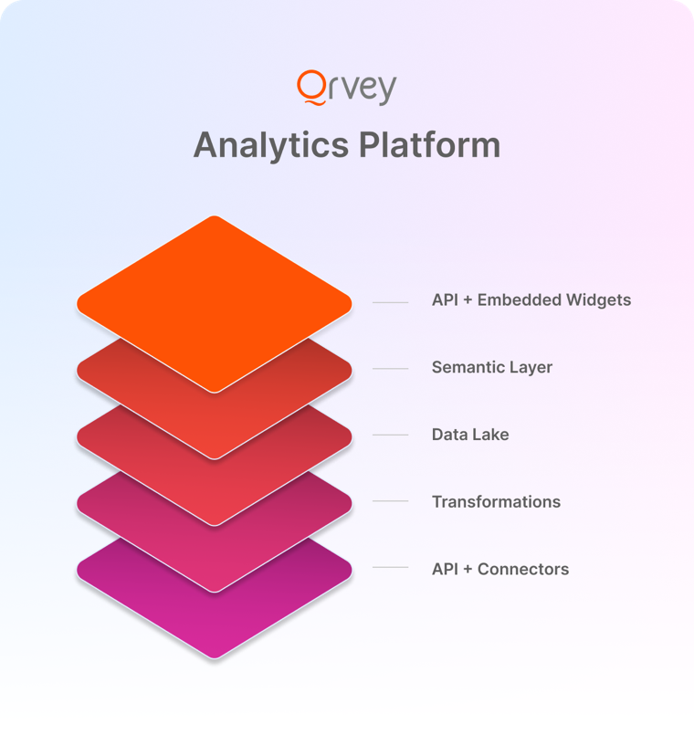
#1 Qrvey
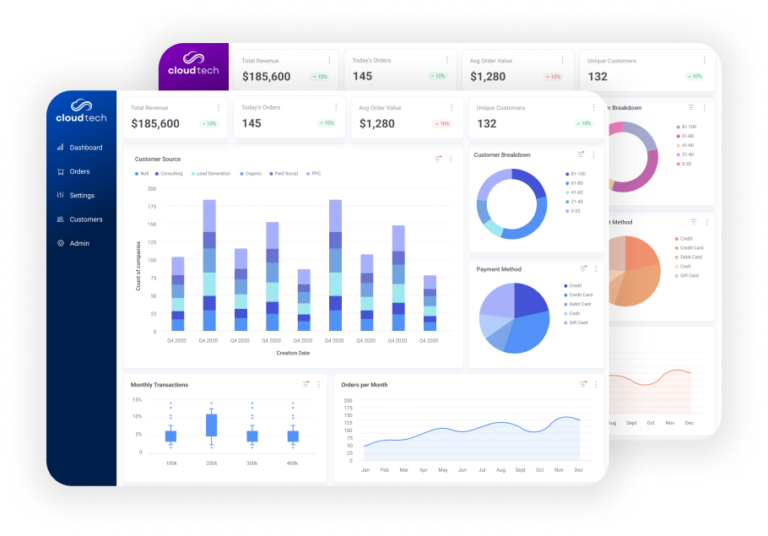
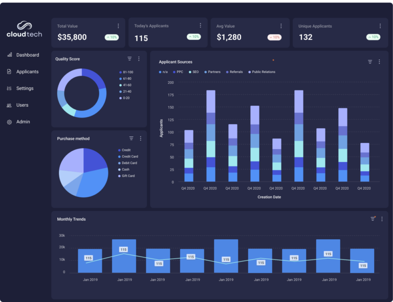
Qrvey is a self-service embedded analytics platform designed for SaaS providers that need scalable, multi-tenant analytics without the complexity and cost of traditional BI tools.
Unlike Sisense, Qrvey prioritizes full control over embedding, automation, and white-labeling, making it ideal for organizations that require deep customization and seamless integration.
Key Features
Self-service embedded analytics for enterprises and SaaS platforms
Integrate analytics into your software while maintaining complete control over branding and user access.
- Multi-tenant architecture with role-based permissions.
- White-labeling options for a fully branded experience.
- API-driven embedding for seamless integration.
- Fully self-service analytics that is easy to use and maintain.
No-code automation for data workflows
Eliminate manual data processes with intelligent automation.
- Workflow triggers to automate data collection and transformation.
- Integrated data preparation tools for real-time insights.
- AI-powered enrichment to surface trends automatically.
See how to build a workflow with Qrvey in this clickable demo.
API-first and developer-friendly customization
Qrvey is built to be flexible, scalable, and customizable.
- RESTful APIs for seamless integration with existing systems.
- Customizable UI components to match your platform’s design.
- Elastic scalability to handle growing data needs.

Pricing
Unlike traditional per-user BI pricing, Qrvey’s flat-rate pricing model is designed for scalable embedded analytics, taking into account multi-tenancy, automation capabilities, and deployment requirements.
| Plan | Pricing | Note |
|---|---|---|
| Qrvey Pro | Flat-rate | Unlimited users, dashboards, instances, data, and connections |
| Qrvey Ultra | Flat-rate |

Where Qrvey shines
- Designed for embedding – Unlike Sisense, Qrvey is purpose-built for embedded analytics, ensuring better flexibility and performance.
- End-to-end automation – Qrvey goes beyond dashboards by automating the entire data lifecycle, from collection to data visualization, reducing manual workload.
- Developer-first approach – Built with APIs at its core, Qrvey makes it easy for developers to integrate and extend analytics without limitations.
Where Qrvey may fall short
- Not an out-of-the-box BI tool: Best suited for companies that need embedded analytics, not standalone dashboards.
Customer reviews
“Qrvey is one of the only tools out there that gives us the ability to embed a full suite of analytics into web apps. Qrvey’s embed capability goes beyond charts and dashboards, letting us integrate a full analytics authoring interface into apps. The API support is pretty excellent as well.” – Dara K, verified G2 user.
Who Qrvey is best for
- SaaS companies that need multi-tenant, embedded analytics at scale.
- Product teams looking for API-driven, automated data analytics without engineering bottlenecks.
Want to see Qrvey in action? Book a demo today!
#2 Tableau
Tableau is a business intelligence platform known for its data visualization and interactive dashboards. It is a solid alternative to Sisense for organizations that prioritize self-service analytics, drag-and-drop reporting, and AI-driven insights.
Key features
- Drag-and-drop dashboard builder: Allows users to create interactive data visualizations without coding.
- AI-powered insights with Ask Data: Enables users to query data using natural language.
- Robust integrations: Connects Tableau with a wide range of data sources, including SQL databases, Google Analytics, and Salesforce.
Pricing
Tableau offers user-based pricing across three solutions: Tableau Cloud, Tableau Server and Tableau Next. Tableau Cloud and Server start at $15/user/month, and Tableau Next starts at $40/user/month. Costs scale by capability, deployment choice, and user mix, making budgeting flexible but complex for SaaS teams.
| Plan | Pricing | Note |
|---|---|---|
| Tableau Cloud | Starts at $15/user/month | Every deployment requires at least one Creator license. For additional users, Creator, Explorer, and Viewer licenses are available. |
| Tableau Server | Starts at $15/user/month | |
| Tableau Next | Starts at $40/user/month |
Where Tableau shines
- Best-in-class data visualization: Offers an intuitive drag-and-drop interface for building interactive dashboards.
- AI-powered analytics: Built-in AI tools help users uncover insights without manual data exploration.
- Wide range of integrations: Connects seamlessly with various data sources, making it ideal for enterprise reporting.
Where Tableau falls short
- Limited embedding capabilities: While Tableau supports some embedded analytics, it lacks the flexibility of platforms built specifically for embedding.
- Higher costs at scale: The per-user pricing model can become expensive for larger teams or enterprise-wide deployments.
Customer reviews
“Building visualizations is straightforward once you get past the initial learning curve. Tableau Desktop is clunky and lacks the snappy user experience one would expect from modern SaaS apps” – Verified G2 user.
Who Tableau is best for
- Businesses that need interactive dashboards and self-service analytics.
We’ve covered everything you need to know about Tableau for Embedded Analytics here.

#3 Power BI
Power BI, developed by Microsoft, is a popular business intelligence platform that provides affordable self-service analytics with deep integration into the Microsoft ecosystem.
It is a strong alternative to Sisense for businesses that already use Microsoft products and need cost-effective, interactive reporting.
Key features
- Seamless Microsoft integration: Works natively with Excel, Azure, and other Microsoft tools.
- AI-powered analytics: Uses AI and machine learning to detect trends and generate insights automatically.
- Interactive visualizations: Offers a range of data visualization tools with drag-and-drop functionality.
Pricing
Power BI has a tiered pricing model. Power BI Pro starts at $14 per user per month and includes self-service analytics and collaboration tools. Power BI Premium costs $24 per user per month.
| Plan | Pricing |
|---|---|
| Free account | Free |
| Power BI Pro | Starts at $15/user/month |
| Power BI Premium per user | $40/user/month |
| Power BI Embedded | Variable |
Where Power BI shines
- Affordable pricing: Lower cost compared to many other BI tools, making it accessible for small and mid-sized businesses.
- Deep Microsoft integration: Works natively with Excel, Azure, and other Microsoft products for a seamless experience.
- Extensive third-party connectors: A large marketplace of integrations expands its functionality.
Where Power BI falls short
- Limited embedding flexibility: Embedding Power BI into external applications requires additional licensing and lacks full customization options.
- Performance issues with large datasets: Complex queries and massive datasets can lead to slow performance unless using optimized data models.
- Steep learning curve for advanced use: While basic reporting is user-friendly, mastering DAX formulas and data modeling can be challenging.
Customer reviews
“I like the fact that a wide array of data can be visualized into simple charts and graphs. I despise the fact that using this software isn’t really black and white, it takes a moderate level programmer to work on this platform. It requires programming to perform simple calculations” – Verified G2 user.
Who Power BI is best for
- Organizations already using Microsoft products that want deep integration.
- Teams that need interactive reporting but don’t require extensive embedded analytics.

#4 Looker
Looker is a modern business intelligence and data modeling platform designed for organizations that need flexible data exploration and embedded analytics. It is a strong alternative to Sisense for companies that prioritize advanced data modeling, SQL-based analytics, and cloud-native deployment.
Key features
- LookML for advanced data modeling: Allows users to define and standardize business metrics using Looker’s proprietary modeling language.
- Embedded analytics and APIs: Provides flexible embedding options and API access for integrating insights into applications.
- Google Cloud integration: Natively connects with BigQuery and other Google Cloud services for scalable analytics.
Pricing
Looker pricing combines a platform fee plus user-based licenses. Costs scale by users, API usage, and deployment. Pricing can be higher than traditional BI tools, especially for enterprise-scale implementations.
| Plan | Pricing |
|---|---|
| Standard | Usage-based pricing |
| Enterprise | Usage-based pricing |
| Embed | Usage-based pricing |
Where Looker shines
- Strong data modeling capabilities: LookML enables centralized and standardized business metrics across teams.
- Flexible embedding options: API-driven analytics allow for custom integrations.
- Seamless Google Cloud integration: Optimized for businesses using BigQuery and other Google Cloud services.
Where Looker falls short
- Steep learning curve: Requires SQL knowledge and LookML expertise, making it less accessible for non-technical users.
- Slower adoption for small teams: Best suited for companies with dedicated data teams, rather than those looking for an out-of-the-box BI tool.
Customer reviews
“Looker is very user-friendly, even for people without technical skills. While it’s great for most use cases, Looker can be slow when working with very large datasets. Some features feel limited compared to more advanced tools, and it might not be the best choice for complex data transformations.” – Mohamed E., verified G2 user.
Who Looker is best for
- Businesses using Google Cloud and BigQuery for analytics.
Want to weigh your options? Our guide on Looker alternatives can help you decide.
#5 Domo
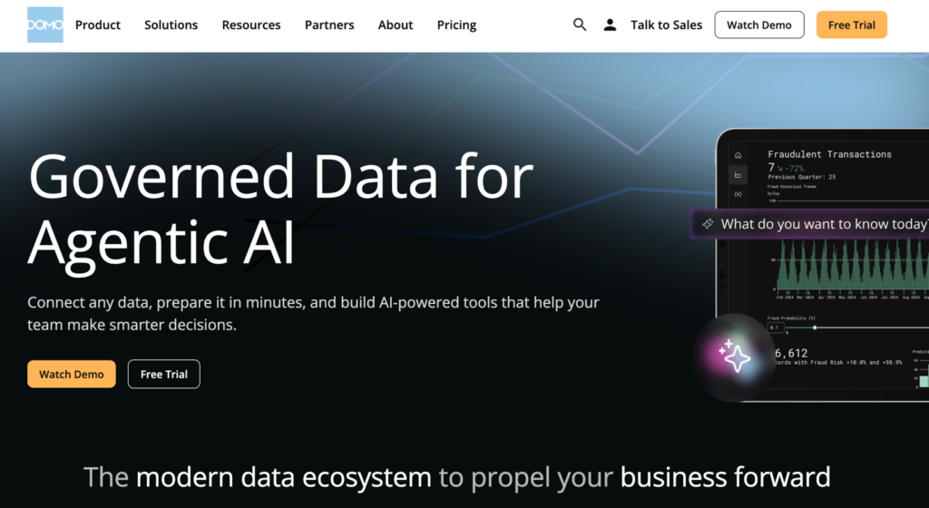
Domo is a cloud-based business intelligence platform designed for real-time data access, mobile-friendly dashboards, and intuitive self-service analytics. It is a decent alternative to Sisense for organizations that want an all-in-one BI solution with built-in data connectors and a user-friendly interface.
Key features
- Pre-built data connectors: Integrates with hundreds of data sources, including cloud applications, databases, and spreadsheets.
- Mobile-first analytics: Optimized for mobile devices, allowing users to access dashboards and insights on the go.
- AI-powered alerts and automation: Uses AI to generate proactive alerts and automate workflows based on data changes.
Pricing
Domo offers a 30-day free trial and uses a usage-based, custom-quote pricing model that scales with data volume, usage and deployment complexity.
| Plan | Pricing |
|---|---|
| Free | 30-day free trial |
| Paid | Custom quote |
Where Domo shines
- Easy-to-use, cloud-native platform: Quick setup with minimal IT involvement, making it accessible for non-technical teams.
- Strong mobile experience: Optimized for teams that need real-time data access on the go.
- Built-in AI-driven automation and alerts: Helps businesses act on insights as they happen.
Where Domo falls short
- Limited embedding and developer flexibility: Not as customizable for embedding analytics into external applications.
- Less advanced data modeling: Lacks the deep data modeling capabilities of platforms like Qrvey.
Customer reviews
“I really appreciate how user-friendly DOMO is—it makes creating graphs and tracking sales super easy. Plus, its real-time data processing helps me stay on top of our sales orders and budget without any delays. Sometimes it feels a bit limited. Also, it can be slow when handling large data sets, which can be frustrating when I need quick insights.” – Anthony D., verified G2 user
Who Domo is best for
- Companies that need a cloud-based, easy-to-use BI solution with minimal setup.
#6 Mode Analytics
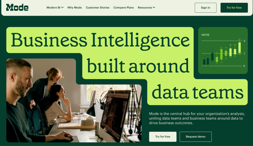
Unlike traditional BI tools, Mode prioritizes direct access to raw data, allowing analysts to run SQL queries, integrate Python and R scripts, and build advanced models—all in one platform. It is a viable alternative to Sisense for organizations that require deep data exploration and collaboration, but it may not be the best fit for teams that prefer self-service, no-code reporting.
Key features
- SQL-first analytics: Analysts can query raw data directly without relying on pre-built dashboards.
- Integrated Python and R support: Users can run advanced models and create visualizations using familiar programming languages.
- Notebook-style interface: Enables data teams to document insights, write queries, and visualize results in a single workflow.
Pricing
Mode offers a free plan with basic reporting capabilities. Pro and Enterprise pricing is available upon request.
| Plan | Pricing |
|---|---|
| Studio | Free |
| Pro | Custom quote |
| Enterprise | Custom quote |
Where Mode Analytics shines
- Powerful SQL-first approach: Gives analysts full control over queries and data exploration without rigid dashboard constraints.
- Seamless integration with Python and R: Allows teams to incorporate statistical models and machine learning directly into reports.
- Real-time collaboration tools: Enables multiple users to share, edit, and comment on reports for faster decision-making.
Where Mode Analytics falls short
- Not beginner-friendly: Requires SQL knowledge, making it less accessible for business users who prefer no-code analytics.
- Higher cost for full functionality: Advanced analytics features require higher-tier plans, which can be expensive for small teams.
Customer reviews
“It can be incredibly useful for comparing and contrasting sets of data and for longterm tracking of stats, etc. Can be difficult to set up new reports if you don’t have a deep background in SQL, as there isn’t much guidance within the software to assist in building out custom reports.” – Verified G2 user.
Who Mode Analytics is best for
- Data analysts and teams that work primarily in SQL, Python, or R.

#7 GoodData
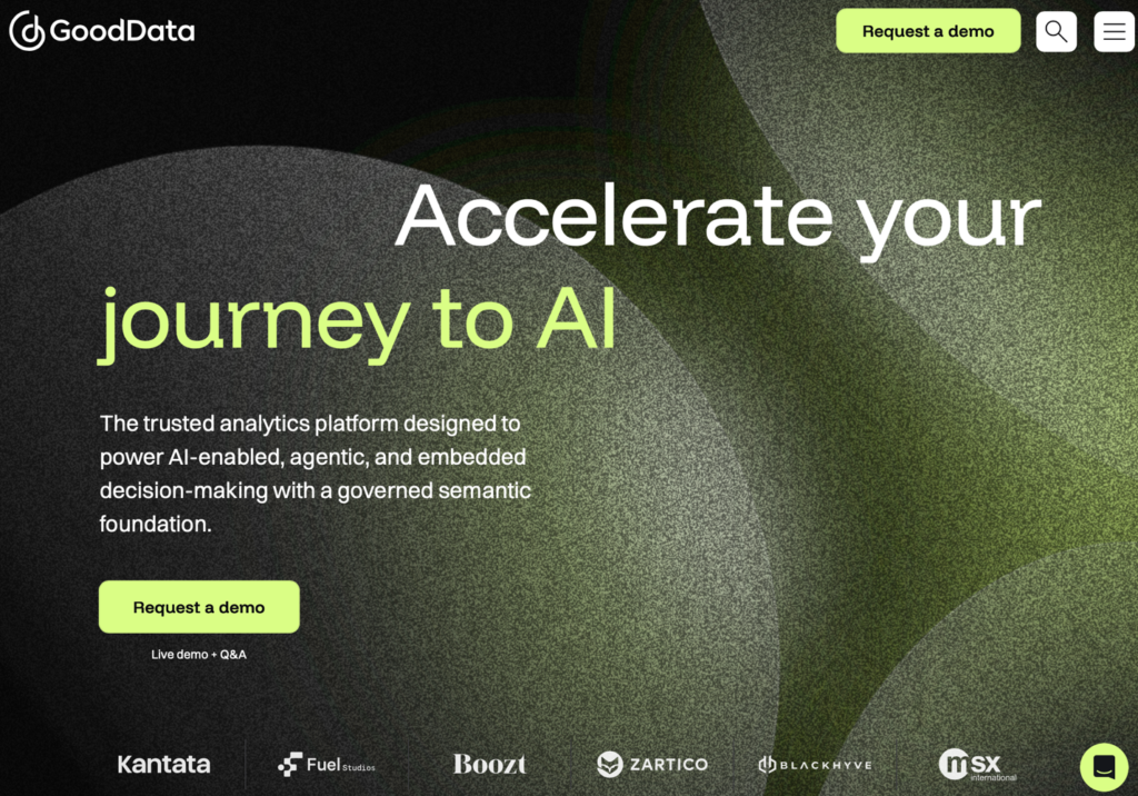
GoodData focuses on delivering analytics as a service, allowing businesses to integrate dashboards and reporting into their own applications. It offers a strong alternative to Sisense for organizations that need scalable, API-driven analytics with multi-tenant support, but it may not be the best choice for companies looking for an out-of-the-box BI tool.
Key features
- White-labeled analytics: Provides fully customizable dashboards that match a company’s branding.
- Multi-tenant architecture: Supports scalable, role-based access for different users and teams.
- API-first approach: Allows developers to embed and extend analytics using a robust set of APIs.
Pricing
GoodData uses a platform-plus-workspace pricing model. It includes a platform fee and scales by the number of workspaces, with unlimited users and data per workspace.
| Plan | Pricing | Note |
|---|---|---|
| Professional | Custom quote | Unlimited users and data |
| Enterprise | Custom quote | Based on use cases, security, and AI capabilities |
Where GoodData shines
- Strong white-labeling capabilities: Businesses can fully customize analytics to match their brand identity.
- Scalable multi-tenant architecture: Designed for organizations managing analytics across multiple customers or teams.
- Flexible API-driven analytics: Developers can integrate GoodData into their applications with extensive API support.
Where GoodData falls short
- Limited out-of-the-box functionality: Requires technical expertise to set up and customize dashboards.
- Customization comes at a cost: Advanced embedding and white-labeling require higher-tier plans.
- Steeper learning curve: Best suited for developers and data teams rather than non-technical business users.
Customer reviews
“The ability to customize exactly what data you see in custom dashboards seems to be one of the strongest props of GoodData. It seems like the possibilies are endless. As a beginner in BI, it was not intuitive to setup. As a result, I feel never truly used it as strongly as I had hoped when I signed up.” – Owen F.,, verified G2 user.
Who GoodData is best for
- Developers and product teams looking for API-first BI solutions.

#8 Metabase
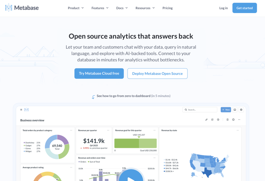
Metabase is an open-source business intelligence tool designed for low-cost, self-hosted analytics. While Metabase is user-friendly and ideal for startups or small businesses, it has limitations in advanced analytics, embedding, and scalability for enterprise use cases.
Key features
- Open-source and self-hosted options: Provides full control over data infrastructure with an open-source version.
- No-code query builder: Allows non-technical users to explore data without writing SQL.
- Lightweight and easy to deploy: Simple setup for organizations that need quick access to reporting.
Pricing
Metabase offers a free open-source edition for self-hosting, and paid plans with advanced features. Pricing starts at $100/month, with per-user fees scaling by features, goverance, embedding, and support needs.
| Plan | Pricing |
|---|---|
| Open Source | Free |
| Starter | $100/month + $6/user/month |
| Pro | $575/month + $12/user/month |
| Enterprise | Starts at $20K/year, custom pricing |
Where Metabase shines
- Cost-effective BI solution: The open-source version is free, making it a great option for startups and small teams.
- Easy to use: Non-technical users can explore data without relying on SQL or complex dashboards.
- Quick deployment: Can be set up in minutes, whether self-hosted or on Metabase Cloud.
Where Metabase falls short
- Limited advanced analytics: Lacks the robust data modeling and AI-driven insights found in enterprise BI tools.
- Multi-tenant embedding and API access require paid plans: The free version does not support advanced embedding features.
- Scalability concerns: Performance may decline with large datasets or high user concurrency.
Customer reviews
“I like that Metabase is relatively quick and easy to use if the reporting layer is set up correctly to use the self-serve options available. If reporting layer isn’t set up correctly with views that accomplish both fact and dimensional qualities, then it won’t be easy to scale as you will be stuck using the custom SQL queries for every card you make.” – Verified G2 user.
Who Metabase is best for
- Startups and small businesses that need low-cost business intelligence.
You can also learn more about other Metabase alternatives in our in-depth guide to see how they compare for growing teams.
#9 Yellowfin
Yellowfin is a business intelligence and analytics platform known for its automated insights and data storytelling capabilities. While Yellowfin excels at surfacing insights proactively, it has limitations in embedding flexibility and developer customization compared to other BI tools.
Key features
- Automated insights: Uses AI to detect trends, anomalies, and patterns in data.
- Data storytelling and collaboration: Enables users to create interactive reports with built-in narratives.
- Flexible dashboards and reporting: Provides an intuitive interface for building and sharing dashboards.
Pricing
Yellowfin uses a custom-quote pricing model for embedded analytics and enterprise BI. Pricing can be based on usage server cores, named users, or revenue share, scaling with deployment size and go-to-market model.
| Plan | Pricing |
|---|---|
| Embedded analytics | Aligned utility model, revenue share model, server core |
| Enterprise BI | Named user, server, user tier |
Where Yellowfin shines
- AI-powered automated insights: Helps users uncover trends and anomalies without manual data exploration.
- Built-in data storytelling: Allows teams to create engaging, narrative-driven reports.
- User-friendly dashboard creation: Intuitive interface makes it accessible for both technical and non-technical users.
Where Yellowfin falls short
- Limited embedding flexibility: While it offers embedded analytics, customization options are not as robust as developer-focused BI tools.
- Additional costs for advanced features: Modules like data storytelling and embedded BI require extra licensing fees.
- Less suited for complex data modeling: Does not provide as much depth in data modeling as platforms like Looker or Qrvey.
Customer reviews
“While Yellowfin BI is powerful, it can sometimes exhibit slower performance when handling extremely large datasets. Additionally, the initial learning curve can be steep for new users unfamiliar with BI tools, necessitating comprehensive training sessions to ensure everyone on the team can utilize the platform effectively.” – Anshul P, verified G2 user.
Who Yellowfin is best for
- Businesses that want AI-driven insights and automated anomaly detection.
#10 Holistics
Unlike traditional BI tools, Holistics takes a model-driven approach, allowing users to define metrics centrally and generate reports dynamically. It offers scalability, self-service analytics, and code-based data modeling, but it may not be ideal for teams looking for drag-and-drop dashboarding.
Key features
- Headless BI approach: Separates data modeling from visualization, allowing greater flexibility in reporting.
- Code-based data modeling: Uses SQL-based logic to define reusable metrics and reports.
- Self-service data exploration: Enables business users to generate insights without modifying the underlying data model.
Pricing
Holistics uses flat, subscription-based pricing. Plans start at $960/month. Pricing tiers scale by features such as reports, users, governance, security.
| Plan | Pricing | Note |
|---|---|---|
| Entry | $960/month for 10 users and 100 reports |
$15/user/month for additional users $120/month for additional 100 reports |
| Standard | $1200/month for 10 users Unlimited reports |
$15/user/month for additional users |
| Security Compliance Suite | $2400/month for 10 users Unlimited reports |
$18/user/month for additional users |
Where Holistics shines
- Flexible, model-driven BI: Empowers data teams to define and maintain business logic centrally.
- Self-service analytics without data silos: Allows non-technical users to explore data while ensuring data consistency.
- Scales well for growing data teams: Designed for organizations that need structured, SQL-based analytics.
Where Holistics falls short
- Embedding features are limited: Not as flexible for embedding dashboards compared to developer-first BI tools.
- Higher learning curve: Teams unfamiliar with model-driven BI may need time to adapt.
Customer reviews
“It’s very easy to use, very intuitive. In some visualizations I would like to have a bit more of autonomy to run my own specific configurations. For instance: mark with colours the cells in a metric-sheet depending on conditions over the numbers.” – Marta G., verified G2 user.
Who Holistics is best for
- Businesses that prefer a headless BI approach for scalable white-label reporting.

#11 ThoughtSpot
ThoughtSpot is an AI-powered business intelligence platform designed for search-driven analytics and natural language querying. While ThoughtSpot excels in ease of use and fast querying, it has limitations in deep data modeling and embedding flexibility compared to more developer-focused BI tools.
Key features
- AI-powered search analytics: Allows users to explore data using natural language queries.
- Automated insights and anomaly detection: Uses AI to surface key trends and patterns.
- Live connections to cloud data warehouses: Integrates with platforms like Snowflake, BigQuery, and Redshift for real-time querying.
Pricing
ThoughtSpot offers Analytics and Embedded. Analytics plans include Essentials ($25/user/month), Pro ($50/user/month or $0.10/query), and Enterprise with custom pricing. Embedded offers a free Developer plan (one year) and a custom‑priced Enterprise plan.
| Plan | Pricing |
|---|---|
| ThoughtSpot analytics | |
| Essentials | $25/user/month |
| Pro | $50/user/month or $0.10/query |
| Enterprise | Custom quote |
| ThoughtSpot embedded | |
| Developer | Free |
| Enterprise | Custom quote |
Where ThoughtSpot shines
- Fast, search-driven analytics: Enables users to ask data questions in natural language without SQL knowledge.
- AI-powered insights: Automatically detects patterns, trends, and anomalies in data.
- Live data connections: Direct integration with cloud data warehouses for real-time analysis.
Where ThoughtSpot falls short
- Embedding flexibility is restricted: Not as customizable for embedding dashboards into external applications.
- Pricing can scale up quickly: Costs increase based on cloud consumption, which may not be ideal for all businesses.
Customer reviews
“There is some great funtionality and the data visualizations can empower the user to discover more and find the answers to their own questions. The functionality and interactivity inside each data tile is not as intuitive as expected. There are some limitations with their existing UI that can be challenging and unable to be modified. This can be a challenge when embedding the product that ideally needs to look/ feel like our product.” – verified G2 user.
Who ThoughtSpot is best for
- Organizations looking for self-service BI without SQL dependency. For a deeper comparison of capabilities around embedding flexibility and developer customization, see this breakdown of Qrvey vs ThoughtSpot.

Reasons to consider an alternative to Sisense
Sisense is a powerful business intelligence platform, but it may not be the right fit for every organization. We summarized the key reasons users consider alternatives to Sisense based on third-party reviews. Below are those reasons, and how Qrvey addresses each one.
Complex implementation
Many Sisense users cite long implementation cycles, especially promoting analytics to product.
Qrvey’s advantage: Qrvey’s no-code automation and API-first architecture simplify deployment, reducing engineering overhead while allowing for deep customization.
High ongoing engineering effort
Reviewers note heavy ongoing engineering effort to manage customization, permissions, and maintenance in Sisense.
Qrvey’s advantage: Qrvey reduces ongoing engineering effort by being embedded‑first and natively tenant‑aware. Governance, security and customization are centralized and configurable, eliminating custom code, duplicated logic, and ongoing maintenance as analytics scale.

Pricing concerns
Users report unpredictable costs from Sisense’s usage‑based pricing and add‑ons.
Qrvey’s advantage: Qrvey offers a flat-rate pricing model aligned to SaaS models, avoiding per-user costs and making it more cost-effective for SaaS providers.
What’s next?
Embedded analytics shouldn’t be an afterthought.
Yet with Sisense, it often is—leading to frustrating limitations, bloated pricing, and unnecessary complexity.
Qrvey changes that.
Purpose-built for embedding, it gives you full control over multi-tenant analytics, automation, and API-driven customization—without the headaches.
See why SaaS providers choose Qrvey. Book your demo today.
FAQs
Do we host Qrvey, or do you?
Qrvey is a fully deployed solution, therefore Customer hosts all Qrvey resources and components. Qrvey deploys into Customer’s cloud account(s) directly in either AWS or Azure.
Can Qrvey push role-based personalizations programmatically at scale?
Yes, dashboard builders who belong to the primary SaaS organization can build role-based custom dashboards and deploy them to all tenant end users who have the matching role
Does Qrvey offer flat-rate pricing that avoids per-seat or per-data charges—and what’s the ballpark?
Qrvey offers flat-rate pricing with unlimited tenants, users, datasets, dashboards, etc. You can also deploy as many instances across as many environments/regions as needed at no extra cost. You can find additional details and request specific quotes from our pricing page <

Natan brings over 20 years of experience helping product teams deliver high-performing embedded analytics experiences to their customers. Prior to Qrvey, he led the Client Technical Services and Support organizations at Logi Analytics, where he guided companies through complex analytics integrations. Today, Natan partners closely with Qrvey customers to evolve their analytics roadmaps, identifying enhancements that unlock new value and drive revenue growth.
Popular Posts

Why is Multi-Tenant Analytics So Hard?
BLOG
Creating performant, secure, and scalable multi-tenant analytics requires overcoming steep engineering challenges that stretch the limits of...

How We Define Embedded Analytics
BLOG
Embedded analytics comes in many forms, but at Qrvey we focus exclusively on embedded analytics for SaaS applications. Discover the differences here...

White Labeling Your Analytics for Success
BLOG
When using third party analytics software you want it to blend in seamlessly to your application. Learn more on how and why this is important for user experience.