Are you tired of staring at spreadsheets and trying to make sense of complex data sets? Data visualization can help you bring your numbers to life and uncover hidden insights. In this article, we will explore the power of data visualization and learn how to create stunning and interactive visualizations that engage and inform your audience.
Whether you are a data analyst, a business owner, or simply someone interested in data, this article will provide you with the knowledge and tools to transform your data into impactful visual stories.
What is Data Visualization?
Data visualization is the representation of data in a visual or graphical format. It allows you to communicate complex information in a clear, concise, and visually appealing way. By using various visual elements such as charts, graphs, maps, and infographics, data visualization enables you to spot patterns, trends, and correlations that might not be immediately apparent in raw data.
Let’s delve deeper into the world of data visualization and explore some of its fascinating aspects.
Data visualization has a rich history that dates back centuries. In the 17th century, the renowned scientist Galileo Galilei used visual representations to depict his observations of celestial bodies. His drawings of the moon’s surface and the phases of Venus revolutionized the way people understood the universe. This early use of data visualization laid the foundation for future advancements in the field.
Fast forward to the digital age, and data visualization has become an integral part of our everyday lives. From interactive dashboards displaying real-time stock market data to captivating infographics illustrating the impact of climate change, data visualization has the power to captivate and inform.
One of the key advantages of data visualization is its ability to simplify complex concepts. Take, for example, the representation of population demographics. Instead of presenting a long list of numbers and statistics, a well-designed visualization can instantly convey the distribution of age groups, gender ratios, and ethnicities. This simplification not only saves time but also makes the information more accessible to a wider audience.
Moreover, data visualization can help identify outliers and anomalies in datasets. By visualizing data points on a scatter plot, for instance, it becomes easier to spot any data points that deviate significantly from the expected pattern. These outliers can provide valuable insights into unusual occurrences or potential errors in data collection.
Another remarkable aspect of data visualization is its ability to tell stories. By carefully selecting the right visual elements and arranging them in a logical sequence, data visualization can guide viewers through a narrative. Whether it’s showcasing the rise and fall of a company’s stock prices or illustrating the impact of a social issue over time, storytelling through data visualization can evoke emotions and create a lasting impact.
As technology continues to advance, data visualization techniques are becoming more sophisticated. With the advent of virtual reality and augmented reality, we can now immerse ourselves in data landscapes, exploring complex datasets in three-dimensional spaces. These immersive experiences open up new possibilities for data analysis and understanding.
Common Types of Data Visualizations
Data visualization encompasses a wide range of techniques and tools, each catering to different data sets and purposes. Some common types of data visualizations include:
Bar charts
Used to compare different categories or show changes over time.
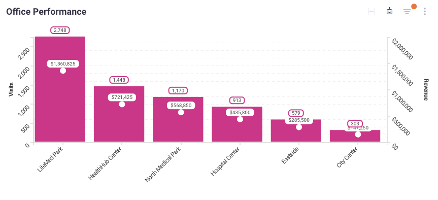
Bar charts are a popular choice for visualizing categorical data. They are effective in comparing different categories or showing changes over time. For example, a bar chart can be used to compare the sales performance of different products in a given year. The length of each bar represents the value of the category it means, making it easy to interpret and understand the data at a glance.
Line graphs
Ideal for tracking trends and patterns over time.
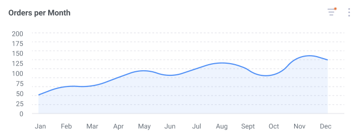
Line graphs are commonly used to track trends and patterns over time. They are handy for visualizing data that has a continuous or sequential nature, such as stock prices or temperature fluctuations. By plotting data points on a graph and connecting them with lines, line graphs provide a clear visual representation of how a variable changes over time.
Pie charts
Useful for displaying proportions and percentages.
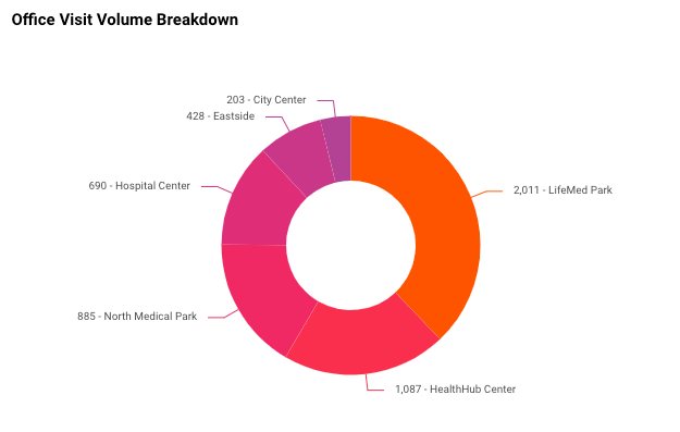
Pie charts are a popular choice for displaying proportions and percentages. They are effective in visualizing how a whole is divided into different parts. For example, a pie chart can be used to show the market share of different companies in a specific industry. Each slice of the pie represents a proportion of the whole, making it easy to compare and understand the distribution of data.
Scatter plots
Shows the relationship between two variables.
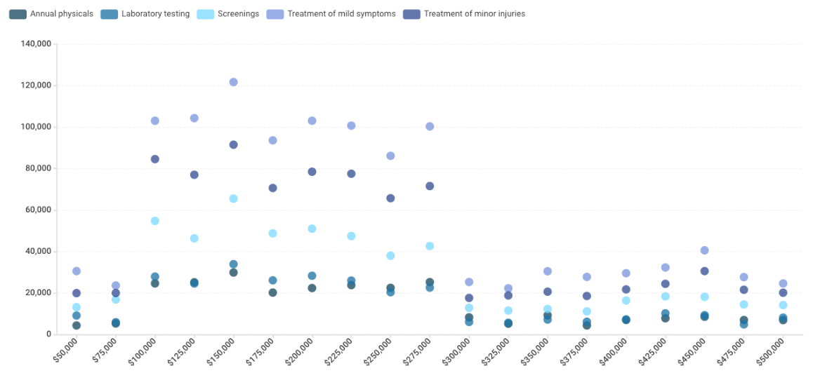
Scatter plots are used to visualize the relationship between two variables. They are particularly useful for identifying patterns or correlations between variables. By plotting data points on a graph with one variable on the x-axis and another on the y-axis, scatter plots can reveal if there is a positive, negative, or no relationship between the variables. This type of visualization is commonly used in scientific research and data analysis.

Maps
Visualize data geographically.
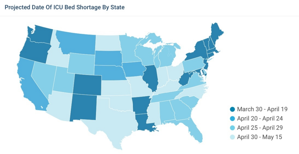
Maps are a powerful tool for visualizing data geographically. They allow us to understand spatial patterns and relationships. By overlaying data onto a map, we can see how different variables are distributed across regions or countries. Maps are commonly used in demographics, epidemiology, and urban planning to analyze and communicate spatial data effectively.
Heatmaps
Visualize relationships
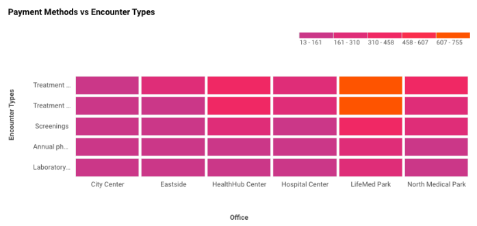
A heatmap is a data visualization tool that uses color coding to represent the frequency or density of activity or events across different parameters. Some key things about heatmaps:
- They allow you to easily spot patterns, trends, and outliers in complex data sets.
- The different color gradients make it easy to identify “hot spots” of high activity vs “cold spots” of low activity.
Radar Chart
A radar chart, also known as a spider chart, web chart, or polar chart, is a type of chart used to visualize multivariate data. The chart consists of a series of spokes radiating out from a central point, with each spoke representing a different variable. The data length of a spoke is proportional to the magnitude of the variable for the data point relative to the maximum magnitude of the variable across all data points. A line is drawn connecting the data values for each spoke, forming a polygonal shape.
Radar charts are useful for comparing the points of two or more different data sets, or for showing the strengths and weaknesses of a single data point.
Some examples of good use cases for radar charts in analytics are:
- Comparing the performance of different players or teams in sports based on various statistics
- Evaluating the quality of a product or service based on multiple criteria
- Assessing the skills or competencies of an individual or a group
- Analyzing the budget allocation and spending of an organization
- Measuring customer satisfaction or loyalty based on different factors
- Radar charts can also be used to display cyclical data, such as monthly or seasonal patterns
Radar charts also have some limitations and challenges, such as:
- The difficulty of interpreting the data when there are too many variables or data points.
- The distortion of the data is due to the arbitrary order and scale of the variables.
- The potential confusion is caused by the overlapping of the shapes or the crossing of the lines.

What Are The Benefits Of Data Visualization
Data visualization offers a plethora of benefits that go beyond simply presenting numbers in an aesthetically pleasing manner. Here are some key advantages:
- Enhanced comprehension: Visual representations make it easier for viewers to grasp complex data quickly.
- Improved decision-making: Clear visualizations help identify trends and patterns, enabling informed decision-making.
- Increased engagement: Engaging visuals capture attention and keep the audience interested.
- Better communication: Visuals transcend language barriers and facilitate understanding across different backgrounds.
- Effective storytelling: Data visualizations help you tell a compelling story and convey insights in a memorable way.
By harnessing the power of data visualization, you can unlock the potential of your data and make it more accessible and meaningful to others.
How To Create Stunning And Interactive Data Visualizations
Now that we understand the importance and benefits of data visualization, let’s dive into the process of creating stunning and interactive visualizations.
The first step is to identify your audience and determine the purpose of your visualization. Are you presenting to executives who need a high-level overview? Are you sharing insights with colleagues who require more detailed information? Understanding your audience and their needs will guide your design choices.
Next, select the appropriate data visualization type that best represents your data and effectively communicates your message. Consider factors such as the data attributes, relationships, and the story you want to tell. Experiment with different visualization techniques until you find the most suitable one.
Once you have selected the visualization type, ensure that your data is clean, organized, and properly formatted. Inaccurate or messy data can lead to misleading visualizations and incorrect interpretations. Take the time to cleanse and prepare your data to ensure accuracy and reliability.
Now it’s time to design your visualization. Consider the aesthetics, colors, and overall layout. Use design principles such as simplicity, consistency, and balance to create a visually appealing and easy-to-understand visualization. Aim for clarity and avoid clutter or unnecessary elements that could distract from the main message.
Incorporate interactivity into your visualizations to provide a rich and engaging experience for your audience. Interactive elements such as tooltips, filters, and animations allow users to explore and interact with the data, gaining deeper insights and discovering patterns on their own. Lastly, remember to test and iterate. Solicit feedback from your audience and make improvements based on their input. The iterative process ensures that your visualization is continuously refined and optimized for maximum impact.
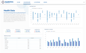
See many of the data visualization examples possible with Qrvey’s embedded analytics solution.
How To Measure The Impact Of Your Data Visualizations
Creating beautiful and informative data visualizations is just the first step. It’s essential to measure the impact of your visualizations to gauge their effectiveness and make data-driven decisions moving forward.
There are several key metrics you can use to evaluate the impact of your data visualizations:
- Engagement: Track metrics such as time spent interacting with the visualization, clicks on interactive elements, and social media shares.
- Effectiveness: Assess whether the visualization helped achieve its intended goal, such as driving conversions or facilitating understanding.
- Feedback: Collect feedback from your audience through surveys or user testing to understand their perception and identify areas for improvement.
- Quantitative measures: Analyze data before and after the visualization’s release to determine if there have been any noticeable changes in key metrics.
By measuring the impact of your visualizations, you can identify what works, and what doesn’t, and continually refine your approach for future projects.
Now that you have a solid understanding of data visualization and how to create stunning and interactive visualizations, it’s time to put your knowledge into practice. Armed with these insights, you’ll be able to transform your data into compelling stories that captivate and inform your audience.
In an embedded analytics scenario, this presents a powerful tool for SaaS companies to offer to their customers within SaaS applications. Qrvey firmly believes in the power of data analysis, and SaaS companies are waking up to the idea that their SaaS application has to offer more than simple static dashboards.
1) Choose the Right Data Visualization Type
One of the first steps in creating an effective data visualization is to choose the best chart type for your data. The type of visualization you choose should depend on the nature of your data and the message you want to convey. In our previous on How to Create Stunning Data Visualizations, we cover some common types with their use cases.
When it comes to data visualization, there are numerous options available, each with its own strengths and weaknesses. Understanding the characteristics of different visualization types can help you make an informed decision.
Categorical Data
For example, pie charts are useful if you want to compare categories or show the proportions of different groups. A pie chart divides a circle into slices, with each slice representing a different category or group. The size of each slice corresponds to the proportion of that category or group in the whole. This type of visualization is particularly useful when you want to highlight the relative sizes of different categories.
Numerical Data
On the other hand, if you want to compare numerical values across different categories, a bar graph might be more suitable. A bar graph uses rectangular bars to represent the values of different categories. The length of each bar corresponds to the value it represents. This type of visualization is effective in showing comparisons and trends.
Relationship Data
If your goal is to show the relationship between two variables or display patterns over time, a line graph or scatter plot might be the way to go.
A line graph uses lines to connect data points, showing the progression of values, typically over time.
A scatter plot, on the other hand, uses individual data points to represent the relationship between two variables. This type of visualization is great for identifying correlations or trends.
Experimenting with different data visualization types can help you find the most effective way to present your data.

2) Eliminate Clutter and Draw Attention to Relevant Data
When creating a data visualization, it is important to eliminate clutter and draw attention to the most relevant data. Too much information or unnecessary elements can distract the viewer and make it difficult to understand the main message of the visualization.
Eliminate Visual Clutter
To eliminate clutter, consider removing non-essential elements such as gridlines or unnecessary labels. Use color, size, or positioning to draw attention to the most important data points or trends. By doing so, you can guide the viewer’s attention to the key insights and ensure that your visualization is clear and focused.
One effective way to eliminate clutter is to simplify the design of your visualization. Instead of using complex charts or graphs, consider using simpler visual elements such as bar charts or line graphs. These types of visualizations are easier to read and understand, allowing the viewer to focus on the data itself.
Use Whitespace
Another strategy to reduce clutter is to use whitespace effectively. Whitespace refers to the empty space around your visual elements. By strategically placing whitespace, you can create a sense of balance and organization in your visualization. This not only makes it visually appealing but also easier to navigate and interpret.
When it comes to drawing attention to relevant data, color can be a powerful tool. Use color strategically to highlight the most important data points or trends.
For example, you can use a bold or contrasting color for the key data points. Then use a more muted color for the less important ones.
This creates a visual hierarchy that guides the viewer’s attention and makes it easier to understand the main insights.

Size Matters
Size is another attribute that draws attention to relevant data. By increasing the size of certain data points or elements, you can make them stand out from the rest of the visualization. This can be particularly effective when you want to emphasize a specific trend or outlier in the data.
Positioning for Attention
Positioning is yet another way to draw attention to relevant data. By strategically placing important data points in prominent areas of the visualization, you can catch the viewer’s eye. An example would be the center or top of the chart. This can be especially useful when you have multiple data points or trends that you want to highlight simultaneously.
When creating a data visualization, it is crucial to eliminate clutter and draw attention to the most relevant data. By simplifying the design, using whitespace effectively, and strategically employing color, size, and positioning, you can ensure that your visualization is clear, focused, and impactful.
3) Make Effective Design Choices
The design choices you make when creating a data visualization can greatly impact its effectiveness. Consider factors such as color, font size, and layout to create a visually appealing and easy-to-understand visualization.
Color
When it comes to color, you want your color palette to allow for easy differentiation between different data categories.
For example, if you are creating a bar chart to represent sales data for different products. Try using a color palette with distinct colors for each product category to help viewers quickly identify data points.
Font Size
Font size and style also play a crucial role in the readability of your visualization. Even if you have chosen a beautiful color palette, bad font sizing can ruin your visualization. Use a legible font size and style that is easily readable, even when the visualization itself is small.
Layout & Arrangement
In addition to color and font choices, the layout of your visualization is equally important. A well-designed layout is intuitive and guides the viewer’s eye through the visualization in a logical manner. Consider the flow of information and the hierarchy of elements within your visualization.
For instance, if you are creating a line chart to show the growth of different industries over time, arrange the industries in a logical order. This along with clear labels can help viewers understand the progression easily.
By making effective design choices, you can enhance the visual impact of your data visualization. Remember to consider factors such as color, font size, and layout to make it visually appealing. And make it an easy-to-understand visualization that effectively communicates your data.
4) Label Chart Modules Appropriately
Properly labeling the various elements of your data visualization is essential for ensuring clarity and understanding. Each chart module or component should be clearly labeled with informative and concise labels.
For example, if you have a bar chart displaying sales data for different months, label each bar with the corresponding month.
By providing clear and informative labels, you can help the viewer understand the data and draw meaningful insights from the visualization.
Understandable Axis Labels
When labeling chart modules, it is important to consider the target audience and their level of familiarity with the subject matter.
If your data visualization is intended for a general audience, it may be helpful to provide additional context or explanations in the labels. This can help viewers who are not familiar with the data or the chart type to better understand the information being presented.
Furthermore, the placement of labels within the chart modules can also impact the overall clarity of the visualization. Labels should be positioned in a way that minimizes confusion and maximizes readability. For example, in a line chart showing the growth of different products over time, it may be more effective to place the labels directly above or below the data points instead of within the lines themselves.
Clear Titles
In addition to labeling individual chart modules, it is also important to provide a clear and concise titles. The title should accurately describe the main purpose of the visualization, allowing viewers to quickly grasp the topic.
Coloring
Another aspect to consider when labeling chart modules is the use of color. Color can be a powerful tool for highlighting important information or patterns within the data. However, it is important to ensure that the color choices do not hinder accessibility or confuse the viewer.
Labels should be easily readable against the background color of the chart module. Additionally, color-blind-friendly palettes should be used whenever possible.
Lastly, when labeling chart modules, it can be helpful to provide additional information in tooltips or captions. Tooltips are small pop-up boxes that appear when the viewer hovers over a specific element providing more detailed information.
Captions, on the other hand, are brief explanations that accompany the chart and provide context for the data.
5) Choose Appropriate Data Scaling
The choice of data scaling in your visualization can greatly impact how the data is perceived and understood. Consider the range and distribution of your data when choosing the appropriate scaling.
For example, if you have a dataset with a wide range of values, such as sales data, it might be more appropriate to use a logarithmic scale to avoid distortion. By choosing the right data scaling, you can ensure that your reporting choices accurately tell the story you want to tell.
Bonus: For Embedded Analytics, White Labeling Matters
Most of this advice applies to any type of analytics. However, the importance of white-label analytics is critical for embedded analytics within SaaS platforms.
One thing we’ve learned through the years is that not everyone has the skillset to create stunning data visualizations. This means as product leaders, guiding your customers to analytics success is critical. White labeling and using features like starter templates go along way.
At Qrvey, we offer highly granular style controls. We empower product teams to create embedded analytics experiences for any user.
Whether you need to offer templates as starting points or custom dataset builders, our best embedded analytics software can enable you to offer something to everyone while making your engineering team happy by shipping more and building less.
Watch a demo here to learn more about what you can expect to deliver.

David is the Chief Technology Officer at Qrvey, the leading provider of embedded analytics software for B2B SaaS companies. With extensive experience in software development and a passion for innovation, David plays a pivotal role in helping companies successfully transition from traditional reporting features to highly customizable analytics experiences that delight SaaS end-users.
Drawing from his deep technical expertise and industry insights, David leads Qrvey’s engineering team in developing cutting-edge analytics solutions that empower product teams to seamlessly integrate robust data visualizations and interactive dashboards into their applications. His commitment to staying ahead of the curve ensures that Qrvey’s platform continuously evolves to meet the ever-changing needs of the SaaS industry.
David shares his wealth of knowledge and best practices on topics related to embedded analytics, data visualization, and the technical considerations involved in building data-driven SaaS products.
Popular Posts

Why is Multi-Tenant Analytics So Hard?
BLOG
Creating performant, secure, and scalable multi-tenant analytics requires overcoming steep engineering challenges that stretch the limits of...

How We Define Embedded Analytics
BLOG
Embedded analytics comes in many forms, but at Qrvey we focus exclusively on embedded analytics for SaaS applications. Discover the differences here...

White Labeling Your Analytics for Success
BLOG
When using third party analytics software you want it to blend in seamlessly to your application. Learn more on how and why this is important for user experience.